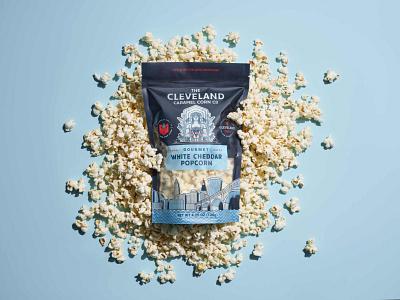
The Cleveland Caramel Corn Packaging
OBJECTIVE: Cleveland Caramel Corn asked us to reevaluate their existing brand of small-batch popcorns and help them find a better packaging solution.
SOLUTION: When we evaluated their brand, it was clear that they had significant equity in the brand elements and did not want a complete change. Our solution focussed on three areas: a new packaging format, a brand refresh, and a new packaging design with custom illustrations.
They started out using poly bags with applied stickers, but it required too much labor and created a bottleneck in production. We suggested moving to a resealable stand-up pouch with a bottom gusset. This allowed for all-over printing for more visual impact on shelves and greater consistency overall.
Their brand was a complex composite image of the Cleveland skyline and the Guardians of Transportation statues, a Cleveland landmark. Our approach was to make the Guardian statue the lead design element, but redraw it as a popcorn-themed mascot. We moved the skyline to the bottom and used that as part of the cutout window to show the product


