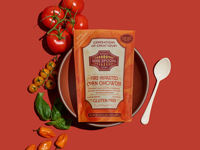
Nine Spoons Packaging Design
OBJECTIVE: To reevaluate an existing brand of heritage soups to increase brand clarity and readability and repackage the product into an easy-to-boil bag that resists breakage and loss in shipping.
SOLUTION: Nine Spoons has been with us since the beginning, but her original brand and packaging were becoming problematic. We kept the most important aspects of the original logo, primarily the spoons and core colors. The new logo keeps reference with Italian design, but in a more compact and recognizable shape and a simpler color palette for greater brand flexibility. Each soup has its own unique colors and imagery to give the lineup quick differentiation among each product.
More by Fizz Creative View profile
Like


