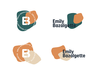
Emily Bazalgette Round One
These were the first concepts I presented to Emily but I've included further images of the work I did that helped form these concpets.
Emily favoured typography based logos, she didn’t want an icon as a mark and I felt a monogram was a good solution. Emily was keen for her branding to include organic shapes so I took my preferred typeface and manipulated the counter spaces and tittle. I combined type, my colour palette from the moodboard and the manipulated shapes together to create the first concepts.
More by Katherine Cory View profile
Like


