UI UX #12: Information Prioritisation and CTA
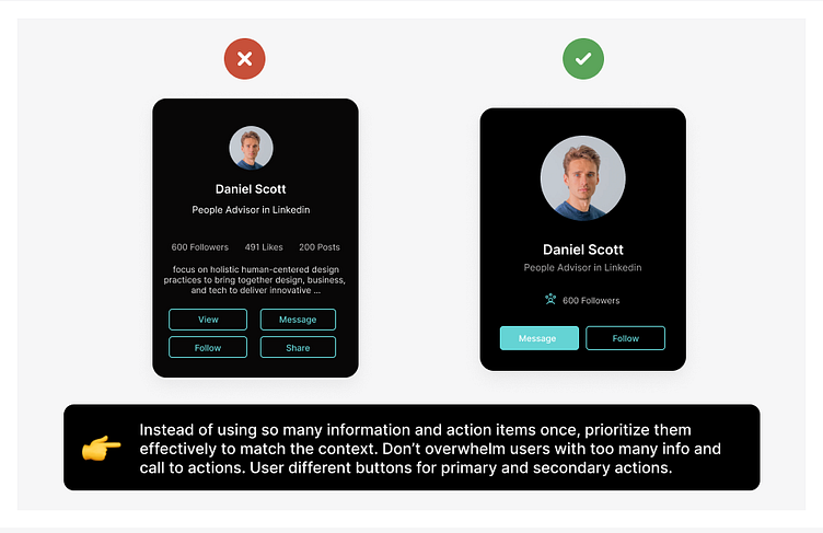
Instead of using so many information and action items once, prioritize them effectively to match the context. Don’t overwhelm users with too many info and call to actions. User different buttons for primary and secondary actions.
More by Himanshu Sharma View profile
Like
