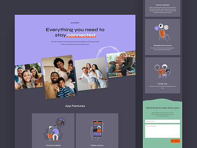
Klosnit LP - dark mode
Hello everyone!
As we all know, the situation sometimes demands being very efficient and creative at the same time. Our client Tomeko approaches to us to validate her idea for a new app called Klosnit.
Klosnit is a platform for family-oriented persons, who feel a strong need to spend time with their family members to maintain intimate contact and communicate with them on daily basis.
The budget was very limited, and we had barely 1 day for creating landing page with mobile version to perform the further testing of POC.
Due to the limited time and to illustrate the main app features, we had to find something available on stocks to create it efficiently. Fortunately, we managed to find the coherent style that fits our needs. We also put an extra work to enhance them changing colors.
I’m happy with the results. I hope you’re too. Stay efficient!
Thanks.
We're available for new projects! Drop us a line at ux@netguru.com
—
Show us love! Press “L”.
Want to see more projects? Visit our profile or Netguru.com and remember to follow us.

