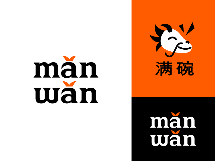
Case study — Mǎn Wǎn Logo Shot
Hey guys!
Here's our recent work - a logo for an Asian food delivery service!
Mǎn wǎn means "full bowl" in Chinese. So why did we choose this name?
Most Asian dishes are being served in bowls. As food delivery service is assembling orders, it was an inspiration to combine bowl and order assembly.
We chose orange as the dominant color, because it is a color of energy, life, joy and… tasty food :)
The key element of the logo is a dragon, which is a personification of the speed of a delivery service.
He is the one who is filling bowls with food.
The pattern displays a dragon, a bowl and hieroglyphs, which are translated from Chinese as “the full bowl”.
Branding by Polina Androsova
More by Desire Creative View profile
Like


