Ballystics Demo Website
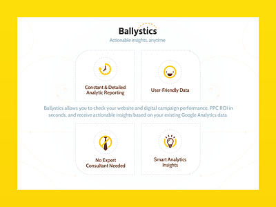
Quick design for the demo website as we're approaching closed beta for our first in-house app Ballystics. We decided to ditch the previous dark theme for the website as we did the same for the app, proved too difficult to keep it both dark, professional and friendly at the same time.
More by Strahinja Todorović (this is very outdated, go to stodorovic.com) View profile
Like

