Email App: More efficient, less formal communication
Role: UX Design, UI Design
Timeline: May 2022 | Tools: Figma, FigJam
The modern online entrepreneur needs an email client that is fast, efficient and a little less formal. Busy people would rather text than email and the user needs features that automate her emails to help her spend less time on email.
Over the last six years, more and more users are migrating toward team communication platforms such as Slack, Discord, and Teams. Busy professionals have realized how to optimize most of their workflow, especially in ways that save their time. This email application combines classic email interface and mashes it up with a more direct messaging component to communication. By adopting this tool, users could save hours of their days, weeks, and years.
This project was completed for the Dribbble Product Design Course.
Research
The foundational research had been established. After understanding the problem and goals for this project I began conducting market research and analysis, and design research.
The main goals that we wanted to include in our product were the following:
Threaded chat style email
Canned responses
Smart folders and filters
Topical organization

Process
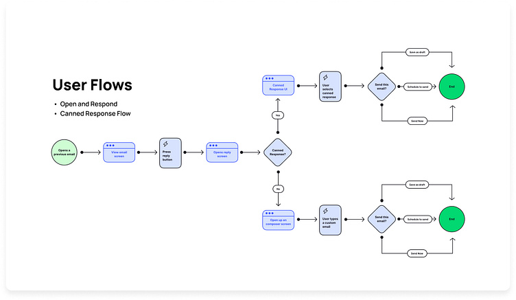
The main feature of the email app is to save time. I wanted this to be designed in a simple and effective way for the user to get that task accomplished. Having canned responses was vital in allowing our user to create an effective workflow to be time efficient. I created a classic user flow that would direct them forward to responding in a simple timely manner.
Before spending too much time on design aesthetics, I developed three iterations of wireframes. This allowed me to focus on the function and flow of the app first. Using FigJam and Figma, the interface evolved from sketches to lo-fi designs.
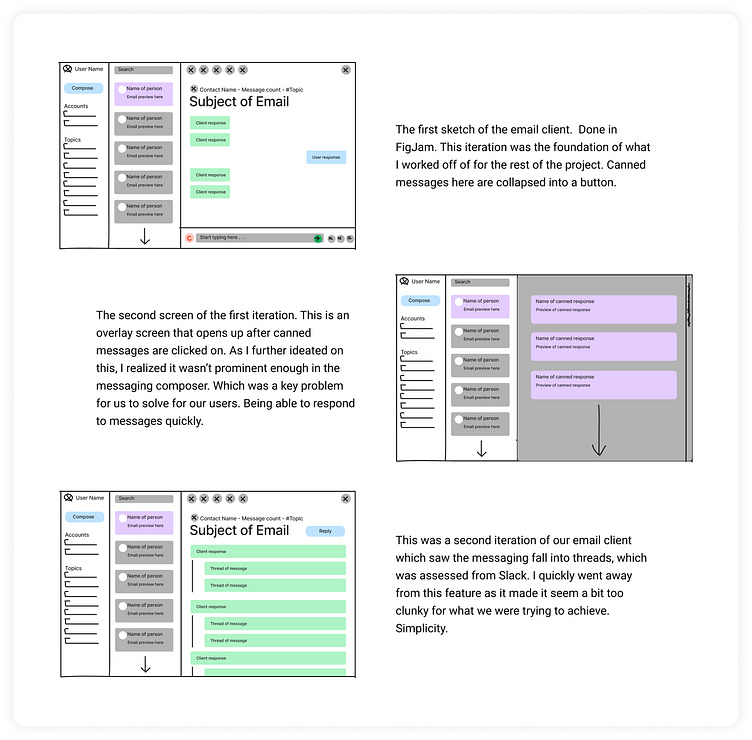
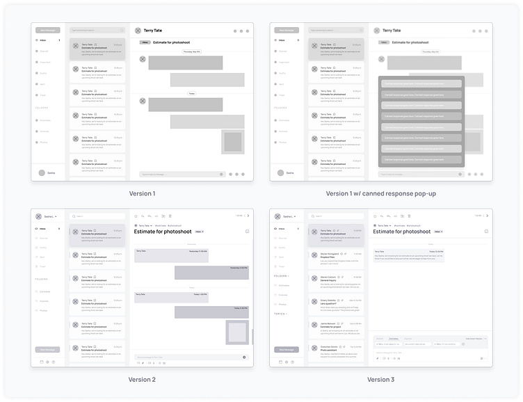
After creating multiple iterations of wireframes, I narrowed in on amplifying the feature of canned messages. Focusing on a design iteration that would bring the canned responses forward I began building out visual designs. With the help of some peer reviews, I was able to make some improvements to the screens.
This included:
Adjusting contrast and color accessibility to text elements
Making sure typefaces were a readable size
Understanding which inbox messages were unread
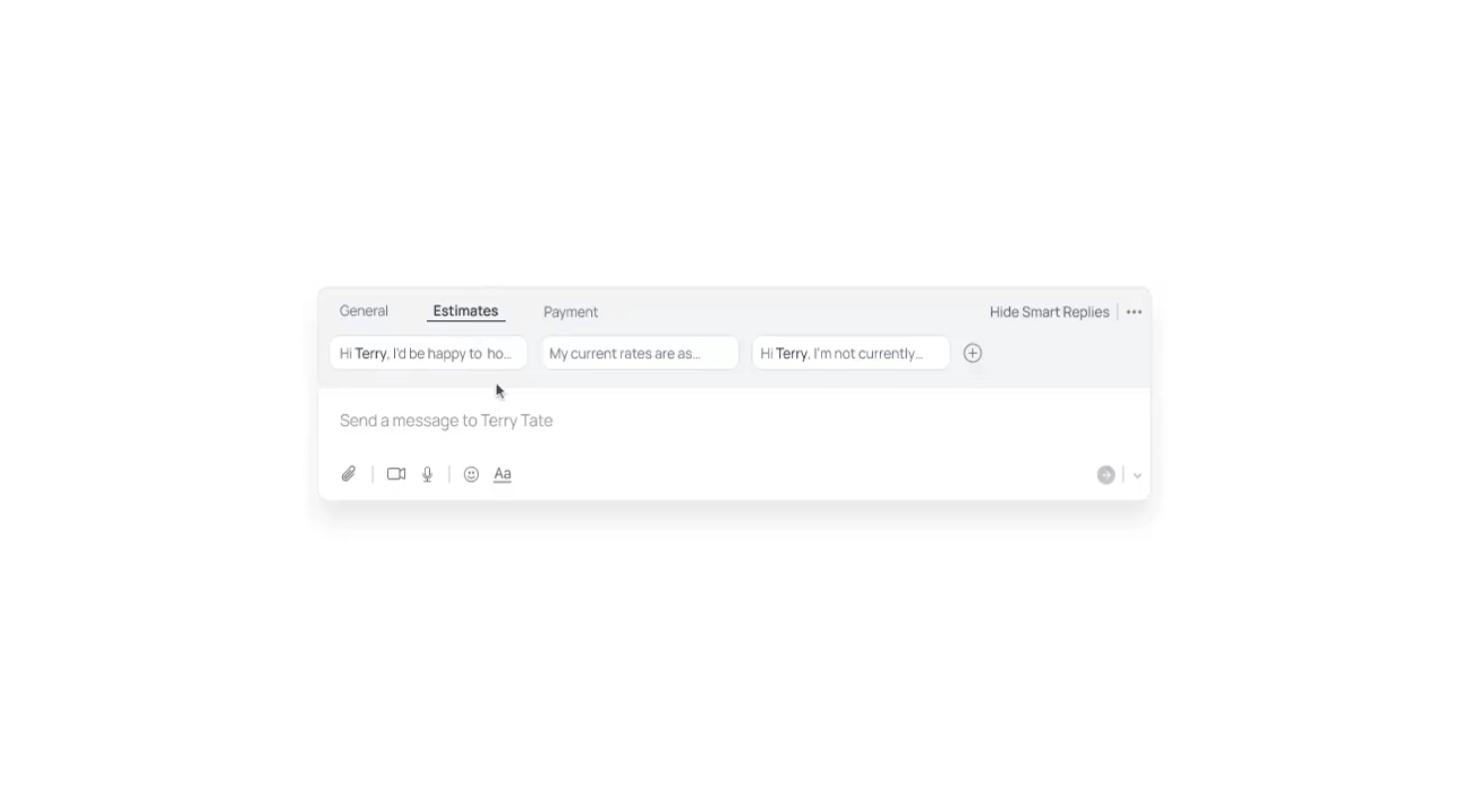
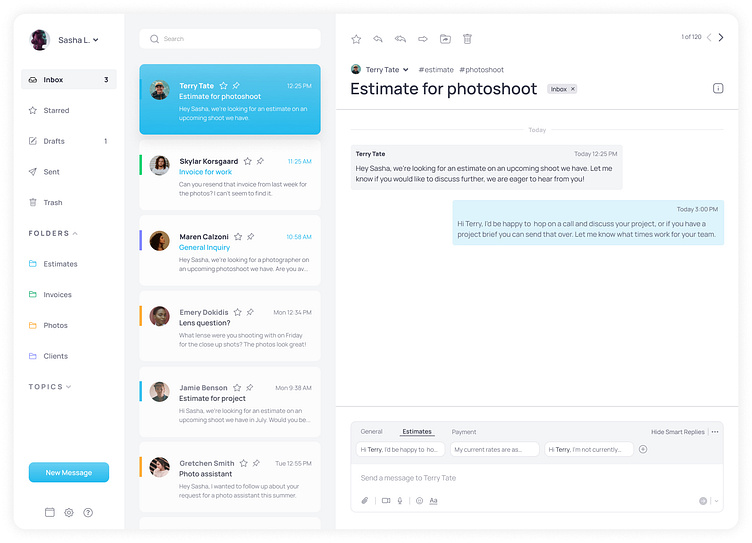
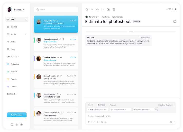
Design decisions: based on the goal of being efficient and spending less time in email, embedding the canned responses into the message composer allows a hierarchy to guide the user to use the feature. Allowing the user to nearly automate their emails helps reclaim time, and have a more productive future.
A few more highlights in the design are imagining the email has a bit of AI that allows the application to automate placing messages in folders, as well as finding keywords that associate messages with filtered topics.
Conclusion
This process was a great building block on my path as a product designer. Focusing on building out extensive wireframes before heading into a more comfortable area of visual designs really helped me focus on what the essential focus was on the app, and how to view it from a user perspective. Always focusing on what the project goals were.
If I could change anything about the process I would like to spend more time and prototype out some of the functions of the message composer.
Overall, I am very pleased with where the email app ended up. My goal was to grow my wireframing skills and focus on essential aspects before visual designs, and project that process onto accomplishing the project goals, and I feel that was accomplished.
