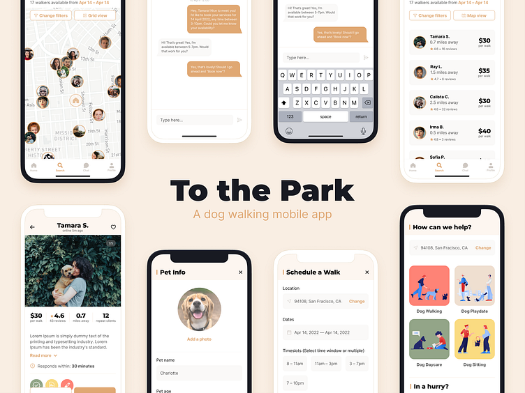
To the Park — A dog walking mobile app
This is a 6-week long assignment that is part of the Dribbble's Product Design Course.
Skills applied: Market research, User research, User flow, Wireframing, Visual design, Prototyping and User testing.
Software used: Figma
The Challenge
Despite the countless number of apps on the market that offer dog-care services, there is still a gap in the market for a well-designed app that caters to both owners and walkers. The task was for me to create such an app, that prioritizes trust, safety and transparency.
User research and Market research
User research
I started the project off by speaking to the end users — dog owners. I wanted to get their perspectives, and understand all their pain points and needs. Through my research, I realized that experience and trustworthiness means the most to the owners as hiring an outsider to care for their dog is usually a last resort.
Market research
Next, I conducted competitor research on other similar apps for pets. This allowed me to understand what works and what didn't, as well as understand why certain apps were more popular with the dog owners. I analysed everything, from the design, to the onboarding flow and ease of navigating around the app.
User flows and Personas
With all the insights I've gathered from my research, I moved forward and started creating personas for the owner, walker and dog. This allowed me to understand their needs and pain points, which helped inform my user flow better.
During my research, I realized that I disliked apps that forced me to sign up without allowing me to browse. Browsing is important for building trust, as I wanted to convince the users that all walkers on my app are qualified and responsible. Hence, in my user flow, I encouraged casual browsing and made sure that sign ups were only for confirmed bookings.
Wireframes
I started work on the wireframes next. I created 6 screens that detailed the onboarding to booking process. I questioned myself a lot along the way, making sure that my user flow made sense when translated into the wireframe design.
I created a second version of the wireframes to see how I could push my design further while keeping in line with the user flow. This proved to be very useful as the end result took visual cues from both version of the wir
Visual Design and Prototyping
Using the competitor's research as a benchmark, I decided to opt for a warmer palette to portray a friendlier and humane image. I made use of heavy bold type contrasted against a regular sans-serif and added some illustrations (huge credits to Anna Golde and Nina Markaryan) for a more modern look.
I created a prototype of the booking process for user-testing. Unfortunately, due to time constraints, I wasn't able to create as many screens as I would like. However, the feedback I've received allowed me to improve on my transitions and highlight crucial pieces of information.
Key takeaways
This was a really fun project as it allowed me to dip my toes in the various stages of product design. From research, to interviews with the users, and up to the actual designing, I've thoroughly enjoyed my learning journey. Of course, I still have plenty more to improve in terms of scaling design systems and prototyping / user-testing. I will definitely be continuing my product design journey and improving my Figma design skills :)


