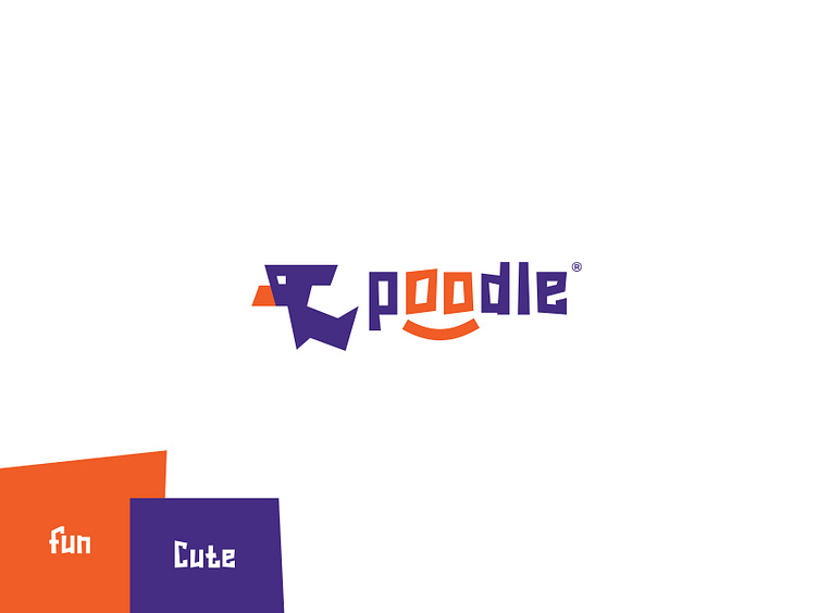
Poodle Pet Company Minimal Branding Design
Poodle®
©2022 All Rights Reserved
Poodle is an imagined pet specialized company where people can buy and sell pets. They're also a pet food company working for healthy pet foods.
They're a company which works for pets, and pets are always playful. They wanted to create a playful brand identity design for their company and here it is what I've designed.
You can find a dog in the logo icon which symbolizes what the company is about and what is their target. (Maybe you can find a bird head shape in the icon which also does the job but that is here automatically. I've just designed it like a dog. :P)
In the colour section, I used a colour palette of Purple/Violet and Orange colour. Where orange represents Fun, Happiness, and Enthusiasm and Purple stand for Royalty, Cuteness.
I have used a playful typeface in the logo text of the brand which makes it super playful. A smile shape is also included in the typeface which makes it more fun and happy. Also, I haven't forgotten about minimalism. I have tried to keep it minimal at the same time it is playful.
This is all Poodle got from me! :D
Press "L" to show me some love! :P
I need your feedback to make myself intelligent as Einstein! So, please leave me a comment! ;P
For business inquiries,
Mail: hello@inbrandit.com
WhatsApp: +8801963851346
Other links: https://zaap.bio/inbrandit


