Donezo - Email reimagined for busy professionals
Tools: Figma | Duration: May 2022
Busy entrepreneurs can spend countless hours communicating back and forth with clients – hours that could be used executing rather than organizing their inbox.
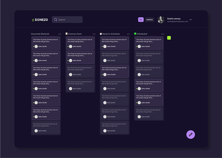
Donezo reimagines traditional email by combining the efficiency of text messages with the quick organizational capabilities of kanban boards. This way, busy entrepreneurs can reduce their time spent emailing and more time back in their business.
The Problem: Traditional email is inefficient and insufficient
The modern online entrepreneur needs an email client that is fast, efficient and a little less formal. Busy people would rather text than email because of the simpler interface, and the user needs features to help them spend less time on email.
In the past years, more and more users are moving away from email and towards team communications platforms like Slack and Discord, which sort conversations into topics. Many freelancers are also making the move, but it’s tedious to constantly invite new people to a Slack channel for a limited engagement.
Busy entrepreneurs also use their email inboxes as a way to keep project manage by marking emails as “unread”. Sorting emails into folders and tagging them into categories takes time to set up, so marking emails as unread and at the top of the inbox is the simplest way to keep track of clients. This, however, is an inefficient way to monitor where a client is at a certain stage of the business process and highlights a key way in which email, with its hundreds of capabilities, falls short.
The Solution: Combining messages with kanban
Looking at how entrepreneurs like myself and my friends use email, I decided to simplify the email interface to mimic iOS Messages combined with the organizational capabilities of a kanban board like Trello.
The primary objective of this email redesign is to reduce the time spent in email and complexities of traditional email platforms into a handful of priority functions.
The secondary objective of Donezo is to allow users to easily manage their clients/projects within email so they don’t have to use an email platform on top of a project management platform (including pen and paper).
Some goal features set are:
Threaded chat style email view
Canned responses
A way to organize emails into topics
Simple way to view tasks “to do”
User Flow
The difficulty of designing Donezo was less about the UI and more about the user flow and how certain email parameters would map into Donezo. Donezo should be able to import all parameters of traditional email such as email subject line, forwarding, replying to certain threads, viewing date and time, etc. but in a different and concise way.
Emails sorted as cards by sender
And so, the user lands on the full view of their kanban board, which displays all emails as cards. Email cards are sorted by sender email address, not by subject line. If there are multiple emails from the same sender, tabs with the different subject lines will display once the email card is opened up.
Organizing emails by custom columns
All incoming emails that have not been sorted will go into the first column, which is default. The user has the ability to then create a column and move an email card to different columns as well as up and down a specific column, giving the user the choice to prioritize certain clients. The columns allow the user to sort emails into whatever category they want, eliminating the need for folders and tags that usually require 2-3 clicks.
Emails that look like messages
The emails look like iOS Messages with the date and time above each email, the ability to easily attach a file, the attachments displaying as inline blocks to the bottom of the email, and the ability to create and add canned responses. These canned responses should help reduce the time responding to photography prices for example.
Less important features are consolidated
Any editing, deleting, forwarding, or blocking features can be found under “edit” in each email card. The function would be similar to iOS Messages.
Focusing on inbox zero
Users can also toggle between all unread emails vs. all emails to help busy professionals focus on getting their inbox to zero.
Visual Design
This was my first time designing for dark mode, and I did struggle with the visuals of this project. Looking at Google’s Material Design for dark theme, I tried to implement their best practices such as using lighter colors to signify hierarchy/elevation of layers, not using pure black or pure white, and playing with the opacity of the dark colors by setting colors in 10% increments of opacity.
Given the 2 week constraint on this project, I was able to flesh out the main view, the email view when opened with subject lines as tabs, emails with attachments, and the add attachment or insert saved response modals.
Takeaways
There are more frames that I would like to build eventually, and I’m still not 100% happy with the colors I chose for the platform. In the future when I have more time, I’d like to redesign this project. I had a lot of fun trying to map out all the parameters that are used within traditional email into Donezo’s more minimal platform, and I’m finding myself gravitating towards the UX side of things.
What are your thoughts? Comment on what I could improve on below!
✅ I'm open to work! Let's connect on LinkedIn


