nganjuknews.com Logo and Why I Design It This Way.
nganjuknews.com is a news portal based in Nganjuk, East Java, Indonesia. They share information mainly about Nganjuk and other happening information in around Indonesia. Recently, nganjuknews.com held a logo contest to rebrand their company and I try my luck in this contest.
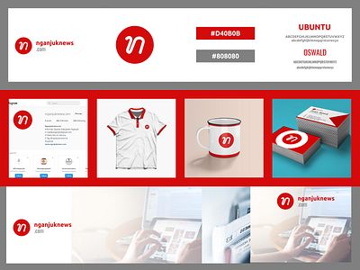
This logo is about Javanese as a media to share Information about their surrounding. I use letter "N" that I fused with Hanacaraka (Javanese Characters) element and a red circle. The Red Circle is a representation of "Surrounding", "Sharing" and "Communication".
Originally, their main color is green with yellow-ish color. But in this logo, I changed it to Red and 50% Black. Red means "High Spirit" and "Proactive". 50% Black means "Professional" and "Neutral".
I hope you guys like it and I really hope you guys give me a feedback about this logo that i designed. Critics and Suggestion is very needed to make me better at designing future projects.
Thank You
:)
