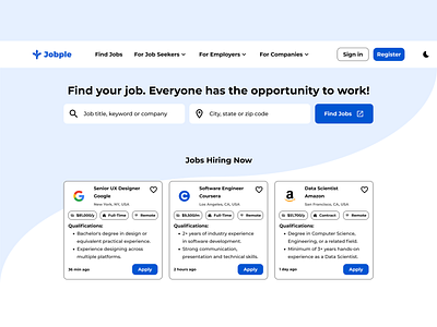
Jobple - Job Search Website UI UX Design Case Study
Hi everyone! Because the case study is a large presentation of the design project and it’s an assignment part of the Google UX Design Professional Certificate, I kept only some important phases. Thanks for understanding! Let’s continue.
Click to view the Mobile App Case Study
Case Study - Responsive Website
This case study includes:
• Project goals and objectives
• My role in the project
• The process I followed
• The outcome of the project
1. Project overview
The product: Jobple is a job search app and responsive website created to ensure job seekers, unemployed people, students, and everyone has the opportunity to work. Also, help them find the right jobs with a fast and easy application process.
Project duration: April 2022 to May 2022
The problem: Most of the unemployed in the communities have baccalaureate, diplomas, certificates, resumes, skills, and experiences, but they haven’t found a job yet.
The goal: Design an app and responsive website for communities to ensure that everyone has the opportunity to work.
My role: UX Designer
Responsibilities: Conducting user research, personas, interviews, problem statements, competitive audit, ideation, conducting paper and digital wireframes, low and high-fidelity prototype, mockups, usability studies, accounting for accessibility, iteration, and determining information architecture and responsive design.
2. Responsive Design
Click to view the High-Fidelity Prototype
3. Takeaways
Impact: The target users shared that the app and website have an attractive user interface and a smooth user experience. They described the user flow as fast and easy.
Quote from a peer participant: “I think the life of an unemployed person without a Jobple app and site would be a mistake.”
What I learned: While working on this project, I focused on designing an attractive user interface for both the app and the website. I learned that UI design is more important than we think.
4. Next steps
1. Conduct other usability studies to find out more pain points that users face
2. Conduct another competitive audit to see what can be added to improve the website performance.
3. Conduct research on adding a learning platform with free access and certificates in the same app and website.
5. Let’s connect!
Thank you for taking the time to review my work! If you’d like to see more or get in touch, my contact is provided below.
Email: ismail.houman@gmail.com
LinkedIn | Dribbble | Instagram | Medium
Thank you!
