Outcrowd - Launch New Website
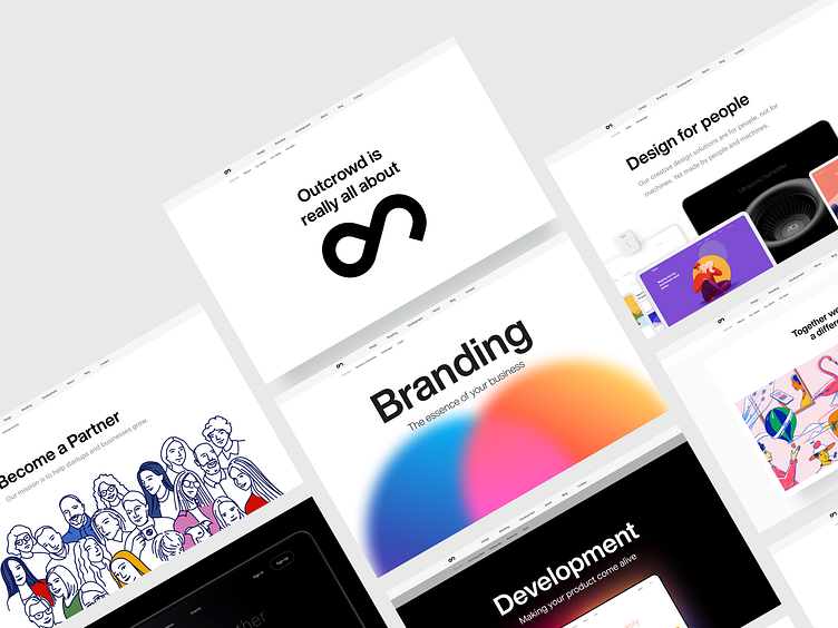
After months of work and improvements, we are ready to introduce you to our new website. Yes! Outcrowd has launched a completely updated website.
A recognizable feature of our site is minimalism. To focus the user's attention on the most important, we used white space and margins.
The homepage is simple and clear. This allows the user not to complicate the path and quickly find what they need. In the hero section, you can always find one of the fresh cases.
Before you go to the website, check out this case and share your feedback ❤️
When we thought over the website concept, we decided to present each service as a stand-alone product. This is what set the structure and further content of the site.
✔️ Web Design
✔️ Branding
✔️ Development
We used gradients and a limited color palette. Being on any page of the site, the design will be recognizable.
Also, a feature of our design is Animation, 3Ds, and illustrations. What makes the website really distinctive and memorable.
There are many additions and updates to our website ahead.
Keep in touch and follow our news!


