HornOkPlease Restaurant Design
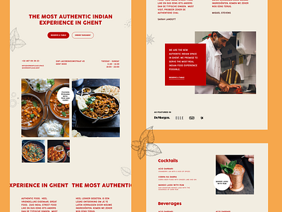
This is a redesign of an existing website, the idea was to revamp the homepage, I wanted to use the colours of Indian food, moving away from the blue tints on the current homepage. The food tastes great and looks delicious, so the pictures needed more attention, which is what I achieved with this grid.
More by Miguel Stevens View profile
Like
