Dog Walking App: Buddy
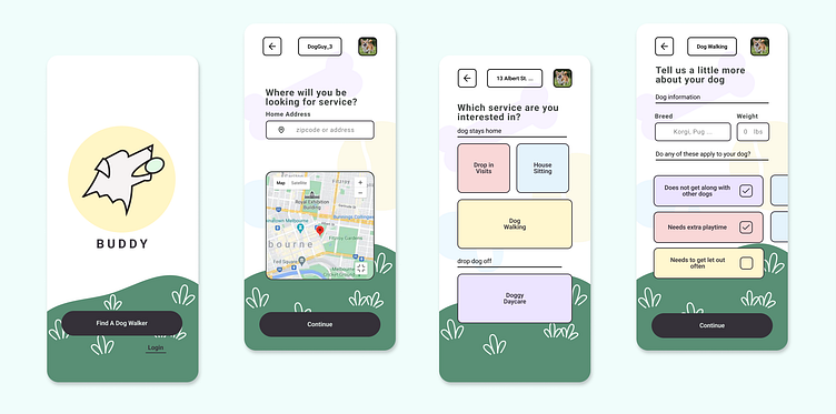
Buddy is a simple looking and easy to navigate dog walking app. It is aimed at reducing the stress that dog owners feel when then need to use a dog walking or dog sitting service.
The Final Prototype & Design
This prototype takes a dog owner though the onboarding process, from opening the app for the first time through selecting a service for their pet.
Summary
As a new designer. I approached this brief with fresh eyes and an open mind. I learned a lot about getting feedback on designs, testing for usability, and the importance of keeping things simple. But my biggest take aways are:
1. Keeping organized with your components and layers is key if you want to update designs in the future.
2. Consistent placement of elements between screens is necessary for the flow of the app in the prototyping stage
3. Background elements can add to the personality of a project, but also take away from the usability if done wrong
4. Simple designs might not be as visually pleasing, but they’re easy to use.
About Me:
Read More: My In-Depth Process
Brief
Problem Statement
How do we quickly build trust between two people, dog owner and dog walker?
User Research
After talking with several dog owners. I had a great conversation with my friend Josh. He largely became my user persona. He had issues trusting his dog with a total stranger. Zoey, his dog, needs a little more attention than most dogs. When asked if he was looking for any extra features out of a dog walking service he said:
“yes. I would like to know the last time my dog has been gone to the bathroom. My dog has a small bladder and if she doesn’t go every so often she will probably go in the house“.
All dogs are different and have different required amounts of care. I believe this makes dog owners more hesitant to hand over their dog to another person. How would a stranger know exactly what my dog needs? A good service for Josh would be easy to onboard to and build trust that he will be connected with the right dog walkers.
User Flow
With the core tenants of the Buddy service laid out I moved to the user flow diagrams. In the market research phase there were several things about the dog walking app Rover. The onboarding process felt quick and concise. I did find that It didn’t offer places for the dog owner to list extra care options for their pet. I believe this is the key to getting the best dog walker for your dog. Having dog walker that fits you dog best will build that trust. Armed with this theory, I built a user flow out of the Rover flow with more spots to fill those doggy details.
Wireframes
When moving to wireframes I had started converting the user flow 1:1, before starting to group and reduce the screens. After I was satisfied with the number of screens I started converting the sketches to more finished wireframes with a component library. Things weren’t perfect, but it was more than enough details for me to move into UI planning stage.
With the the rough screens mapped out it was time to add some colors. There was a lot of iterations in this step. I needed to keep things simple for usability and wanted to keep the colors and shapes low stress. I landed on white background with mostly pastels colors for buttons. The raw components and simple colors felt too empty, so created a handful of dog themed SVGs to sprinkle in the background. Finally things had the personality that I was looking for.
Prototyping and Testing
Finally I assembled my prototype and conducted several usabilities tests on some friends. There was feedback that one of my scroll sections was confusing to look at and didn’t scroll the correct direction. Additionally there were some button spacing issues between screens and a missing error box. After resolving these usability issues, Buddy was finished, at least a version 1 of it. This was great learning experience taking a design through all of it’s stages


