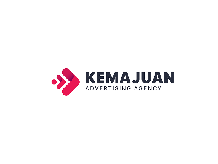
Logotype

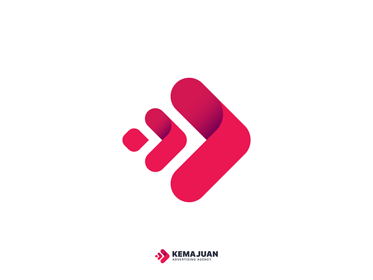
Here's a logo mark I have done it for an advertising and marketing company, their main diffraction was fast forward business strategies!
So I choose single color "raspberry red" to grab the attention and make it direct, then the idea was "evolution and the process of they operate" so!! dot representing the a new idea or unmoving problem which evolves to an arrow representing solution/direction/target/business then evolving to a bigger arrow meaning proving the target and taking the business to the next level... all together creating Fast, Forward, Direct Strategies.
Hope you like it too, Comments are highly appreciated. :)
