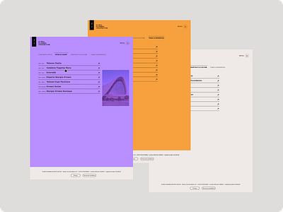
Website restyling_Global Planning Architecture_Works
Brief: The goal is to give a new look to the site while maintaining an elegant and balanced look.
Problem statement: the previous site lack of UI Style Guide. The website needs a UI Style guide that will help with the color theme of the site, the information architecture, the consistency and the organization.
I redesigned the homepage trying to play with color and composition, using orange as dominant color and lavender for contrast but also balance.
For typography I used the Neue Machina, a sans serif font that transmitted modernity but also solidity by associating it with Poppins for the paragraphs.
More by Giuliana Cernigliaro View profile
Like
