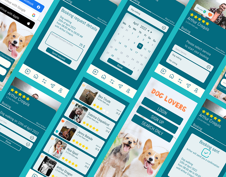
Case study Dog walking app Dribbble's Product designer course
As my first digital product case study. We’ve been requested to design an application for dog owners in need of dog walking/sitting service.
Interviews
One of the first steps was to interview dog owners in order to identify their needs and expectations. Recurring concerns of dog owners tend to be the following 3 main points.
User Journey
Here is my first iteration of user flow concerning booking of walks for a regular user. Using the research, I tried to simplify the experience as much as I can in order to avoid wasting user's time.
My proposal was to save as much data as possible linked to the user, this way they will get custom results based on the settings provided at first login. They’ll also see their favorite walkers on top of the results.
Wireframes
As I had defined what I want to propose for the user, It was time to start thinking about the layout.
Here's some wireframes.
At this stage, my solutions for the 3 user's concerns are:
Vicinity -> Showing in dog walker results page the distance between the owner and the walker.
Trust -> Showing ratings for each dog walker provided by other users
Security -> This part will be covered by the option to ask for a test walk and that dog walker will need to confirm they have insurance when creating an account on the app.
Visuals
Color palette applied to components
Prototypes
With the help of Figma, my visual designs came to life live and allowed usability tests and iterations.
User test journey provided to testers
Tester goal:
Please login and try to book a dog walking hour with Arthur Croquis on 10th of april from 08:00 to 09:00.
Tip:
Email address and password will be automatically filled by clicking in email login frame.
1st tester raise some improvement points:
active page were not sufficiently highlighted
message box and validation button color were too close and cause confusion
After amendement, 2nd tester benefits clearly from those improvements with no blocking points during his test.
Here is link to final version if you want to try it by yourself :
https://www.figma.com/proto/M9JK0tmlKdpSSSWrDWMmWl/Dog-app---(Jenifer-Hinal)?node-id=61%3A6727&scaling=scale-down&page-id=0%3A1&starting-point-node-id=61%3A6727
Outcome
"A user interface is like a joke,
if you have to explain it,
it's not that good"
- Martin Leblanc
I saw this quote some time ago, but I didn' t realise at this moment all the steps and work that need to be processed before things become simple and intuitive for users.
I've learned so much during this case study.
I'll mostly remember to start testing as soon as possible on low fidelity prototype.
Thanks for your time!!!


