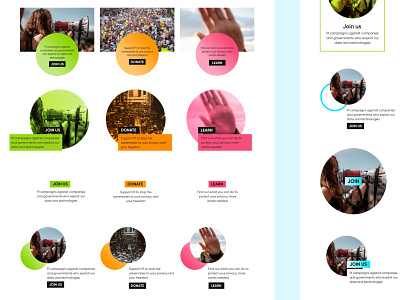
Privacy International Homepage Boxes
https://privacyinternational.org
Every so often there's a sticking point on a web template, sometimes it's the placement of the newsletter but for PI it was three buttons on the homepage. They were important as they were the main three calls to action on the homepage and one of the first pieces of content a user sees after the slideshow. They were also a pattern we wanted to use on other sections on the website.
I went through many iterations and tried so many different ideas. In the end, the buttons that were signed off and launched with the new theme were actually replaced by an older iteration 6 months later.
More by Katherine Cory View profile
Like


