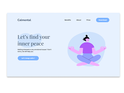
Daily UI 03 - Landing Page
This is a part of landing page about a mental health app. I will explain briefly about my design decisions:
1. In color psychology, blue is a color of calm and relaxation, so I choose blue as primary color
2. I choose a serif font for heading to give the landing page a more elegant look
3. I make the round border button to make it look more smooth and make people feel more ease
4. Since the purpose of this landing page is to introduce about the app, the content in the navbar is to help people know more about its benefits and price
I'm really hope to get feedbacks from you guys <3
More by Leon Thái View profile
Like
