Dog-Go: Pet Services App Case Study
Dog Go is an app that provides dog care services with an emphasis on safety.
Problem Statement
Busy professionals, vacationers, those with disabilities or injuries, or people who need pet assistance for any other reason, need a way to access dog care services in a quick and easy manner that they know they can trust.
My Role
• Market research and interviews
• Creating a user flow for sign-up and finding a dog walker process
• Wireframes
• Visual design
• Prototype/User testing
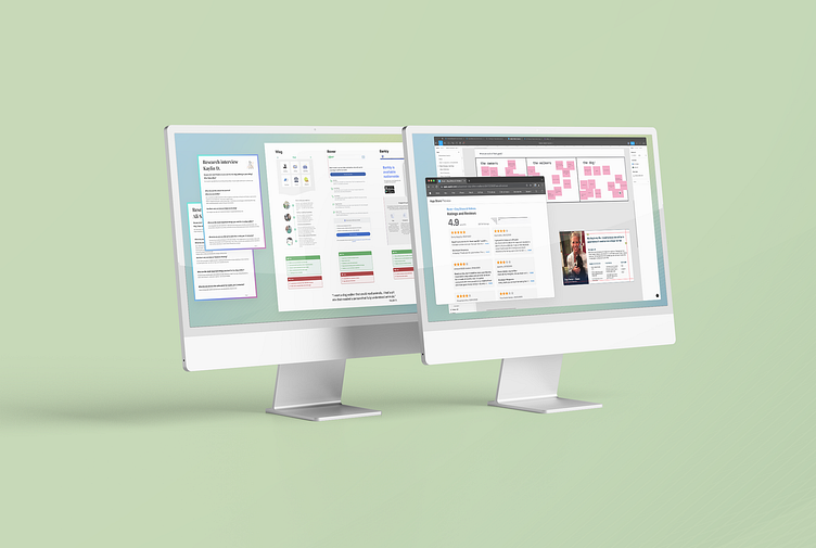
Market Research and Interviews
Market research included reviewing websites, app store reviews and signing into the apps for Rover, Wag and Barkly Pets. Interviews were conducted both in-person and by phone call. Collaboration with a team of 5 designers to discuss results gave us a pool of around 20 participants.
Key Takeaways From Market Research:
The key takeaway from my research was that this is a competitive industry with strong, established and well designed apps. Rover seems to be the strongest competition, closely followed by Wag, with Barkly being smaller and having more technical issues.
On a 5 point scale, the competition ratings were as follows:
1. Rover - 4.9 on 307.5k reviews
2. Wag - 4.8 on 43.3k reviews
3. Barkly Pets - 4.4 on 60
Focusing on Rover as the top competitor, there were overwhelmingly 5 star ratings saying: Great features on the app, friendly walkers, great tech where you can track the walker, receive pictures while the dog is being walked, etc.
However, I did see some common responses for negative reviews as well:
Problem 1: Even though there is a filter to only show walkers available on the dates a user inputs, "it takes XX number of attempts to book a walker who is actually available on those dates."
Possible solution: Before pen touches paper with a UX experience, set a meeting to talk with the team. Is it possible for us to get feedback from users when a walker is marked as available but can't walk on selected dates? Can we send the walker a friendly reminder email to keep their schedules up-to-date? If there are repeat offenders, can we have the algorithm put these walkers lower on the list of "Top Results"?
Problem 2: Several users had a bad experience with an individual walker such as the walker "sitting on a bench at the park instead of walking", "lying about bringing another pet on a walk" when the user had their pet profile saying her dog didn't get along with other dogs, and general poor pet care.
Possible Solution: While some of this is inevitable on a high volume app, some precautions should be taken including: Can we incentivize top talent walkers by taking a smaller percentage of earnings if they have accredited dog training certificates? Can we afford to have industry leading background checks for walkers?
Problem 3: A small amount of users found the interface confusing with complaints that certain features weren't included, only to have the Rover support team respond saying those features were indeed available.
Possible Solution: Again, this is inevitable to happen on high volume apps, but making sure we have the best customer support, possible online tutorials, and of course the most simple and easy to follow interface is key to avoiding similar issues.
Key Takeaways From Interviews
Interviews went well and many of the things brought up in the 5 star ratings during my research came up as the most important features needed for a dog walking app to be successful.
One hundred percent of my respondents had some form of safety as their number one priority: Safety for their pet, safety with allowing someone into their home, safety in general with inputting sensitive info into an app.
Some interesting Interviewee responses included:
• A willingness to pay more for certainty of quality walkers with training certificates.
• The idea that a dog taxi would be very helpful to get a dog to the vet on days they couldn't get off work.
• A desire to find one walker and always use them for pet care.
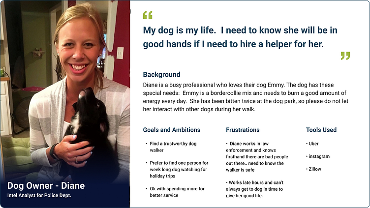
With this info, I created the following persona to base my app design on:
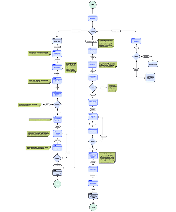
User Flow
From the Splash page, the user has 3 options for signing-in:
1. Using the Sign-up Button - this is the primary button on the page and would likely be used by individuals that have heard of the app and trust it. The first steps of this path collects the users details including email, address, payment info, full pet profile info.
2. Using the Log-in Button - this is the secondary button because it won't always be needed. If a user is signed in on their phone, unless their cache is cleared, they will go directly to the dashboard and not see this page.
3. Browse Pet Care Link - This tertiary option is for those that are cautious of inputting their sensitive info until they know they want to use the app. It collects the bare minimum information from the user to allow the dog walker search algorithm to work, and only asks for sensitive info like email and payment info after the user has found a walker.
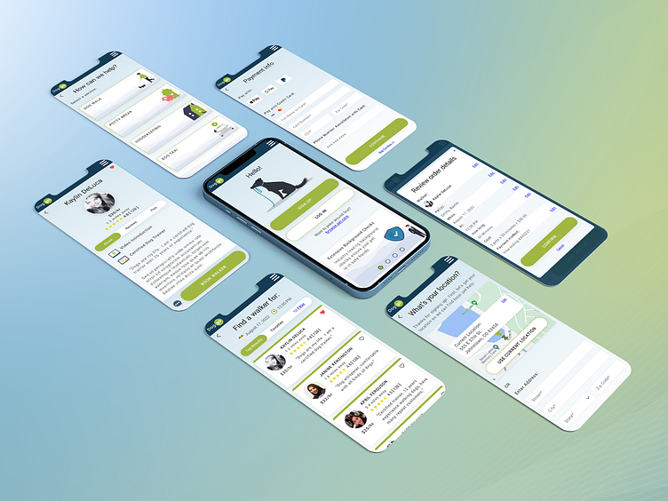
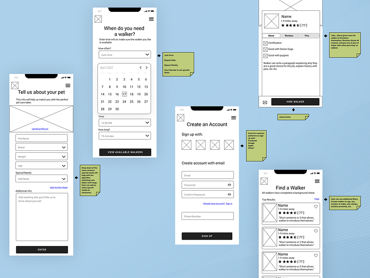
Wireframes
I created "quick and dirty" wireframes to help move the project along fast while giving a good idea of what would work and what needed edits for the final UI skin.
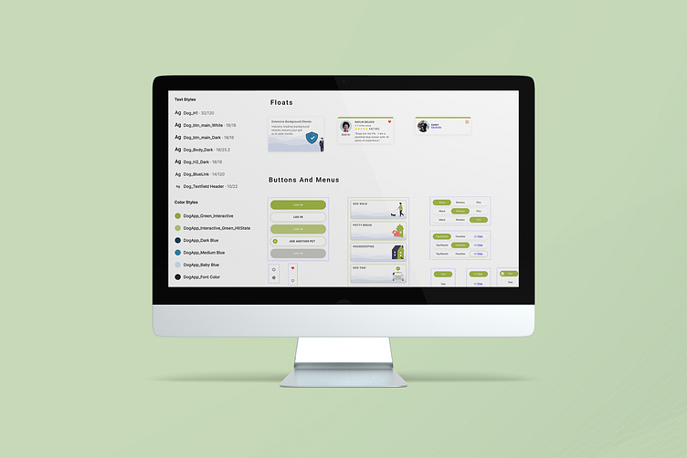
Visual Design
UI began with developing a Mini Design System.
• Colors: blue to represent trust, green for energy and "go", and combining a blue fade into green to represent sky and grass to symbolize "getting your dog out" on a nice day.
• Components were developed to make interface easy to update and consistent.
• Roboto font was used to keep the design simple and clean
• An 8 pixel grid system was used to keep things consistently spaced.
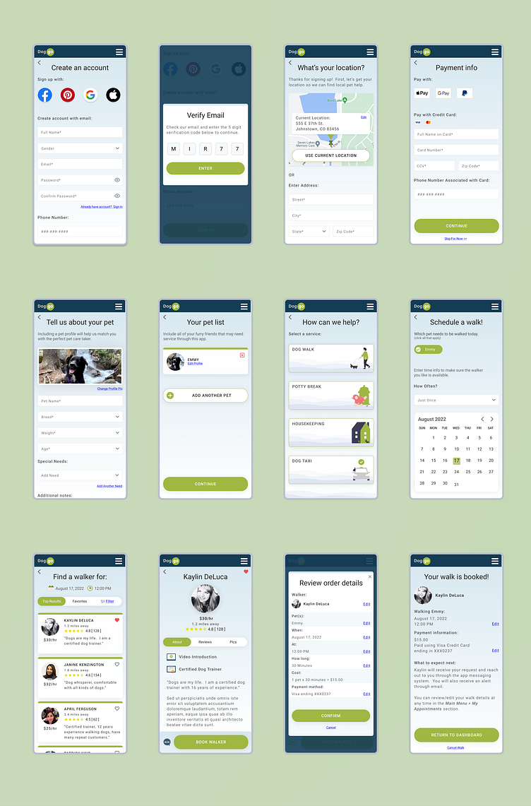
Prototype/User Testing
Once an interface was created, I moved to prototyping and testing. Each screen was made responsive so it could fit properly on different phones during testing. I then gave each tester a brief on the expectations of the exercise, what interface elements were functional, and which were not.
Iterations
Based on feedback and observation, the following changes were made:
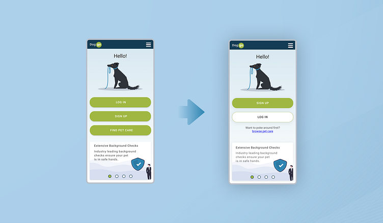
Updated the splash page to give buttons a hierarchy and allow for additional white space.
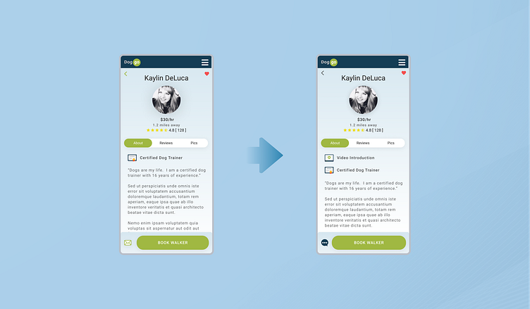
On the walker profile page, I added a Video Introduction option to allow walkers to show their personality with a personal touch, and changed the icon to start a conversation on the footer to be more clear of it's purpose (multiple testers weren't sure what the email icon would lead to).
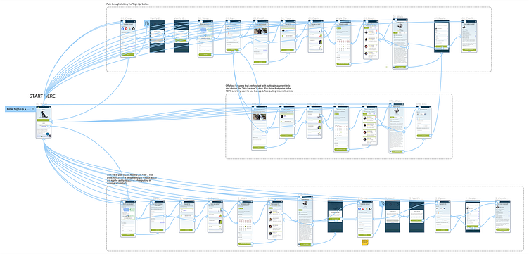
Prototype Flow Through the "Sign Up" Button
This path is heavy up front with gathering a user's personal info.
Prototype Flow Through the "Browse Pet Care" Link
This path allows the user to fully browse the app before committing to inputting their personal info.
Conclusion
Testers had very positive feedback, saying the interface was consistent and easy to follow.
Next time I will find time to add additional functionality to individual screens to make the testing more realistic.