Less is more. Right... [4]
Retail Vision layout
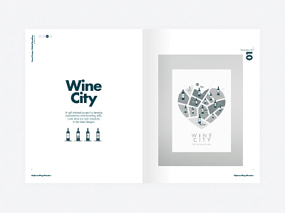
Layout development for the STUDIOJQ portfolio review newspaper project. I thought it would be best to strip down the original design and play more on a duotone and clean gird.
Overall design concept is to illustrate each creative project whilst keeping consistency throughout in grid and image form.
Follow STUDIOJQ:
Behance | Twitter | Pinterest
Designed at STUDIOJQ©
More by MadeByStudioJQ View profile
Like
![Less is more. Right... [4]](https://cdn.dribbble.com/users/43342/screenshots/1829093/media/e568bdb483bb4fab21ba96b77c6b38c4.jpg?resize=400x300&vertical=center)
