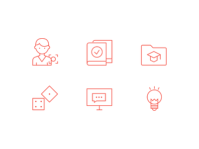
Linear Icons Set for Profitonomy
Less is more. That's what we're thinking when we made the minimalist design for this set of icons for an educational project. Recognizable images and metaphors, contrasting colors and magic is done :)
More by OCHI.ONE View profile
Like
