Music player mobile app UI

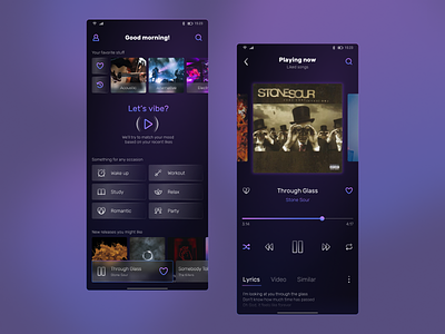
Tried my hand at designing a couple of screens for a music player app. After looking through a bunch of references, decided to step away from a couple of standards in mine. Namely, made the current playing song card on the bottom preview a bit shorter than full screen width so that the user can see what song will play next. Also, added quick access to history from the main home page for those who want to relisten to that song they've heard just yesterday but forgot to save and can't remember its title (happened to myself more times than I can count).
On the main home page, I've decided to place mood playlists at the center of suggestions instead of daily playlists or new releases, which are still there of course but lower in priority.
On the full view of the now playing song, I've decided to add previews of previous and next song in playlist so that the user could swipe between compositions if it's more convenient for them. Also put the lyrics, video (if the song has one attached to it), and similar songs for quick access.
Greatly appreciate any feedback! ❤️
___
Come say hi on my LinkedIn!