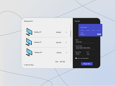
DailyUI #002 Credit Card Checkout
Hi!
This is Day 2 of the Daily UI Challenge.
--------
I tried to keep things simple, but useful. My main focus was on thinking about the user and making his experience as easy as possible. Also, blue seems to me like a great use for anything shopping-related, that's why I used it as the primary color.
The lines in the back are made with the Pen function on Figma. It's different, but I kinda like it.
--------
If you can, please let me know your Feedback. 😊
Don't forget to press 'L' if you like it.
Thank you!!
--------
More by Giulia Lucaciu View profile
Like
