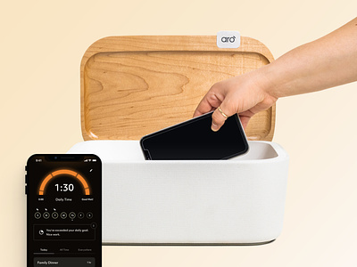
Aro Website
Description
Aro knows that smartphones are amazing—and really, really hard to put down. They make it a little easier by giving your phone a home. Use the companion app to track and celebrate the time you spend away from it.
Our Work
Our entire team was engaged in helping this project launch. We helped with everything from naming, [ahr-oh], to branding, designing the companion app, packaging design, and of course the website.
When it came to the site, we wanted to lean on one of Aro's core brand traits—a quiet presence. The goal of Aro is to minimize distractions so you can focus on something meaningful. It was important that the website felt like it wants to help you accomplish that. The type, the colors, the patterns, and compositions are all meant to coalesce into a calming, serene, supportive feeling.
As a creative agency, it's not lost on us how vital it is to have a right relationship with tech. This project hits close to home and we were thrilled about having a hand in helping people to live life, uninterrupted.
Team
Creative Direction: Kody Dahl
Product Design: Katie Cooper
Web Design: Jose Ocando
Media: Internal: Caleb Allison, Partners: RVRB and Smallhands Creative


