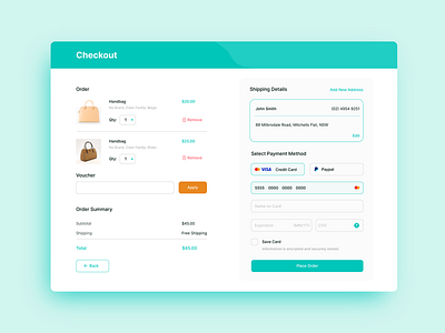
Daily UI: Credit Card Checkout
Day 2 of the Daily UI challenge was to make a credit card checkout page. I thought of making the quantity option a drop down on the checkout page. Rather than making the customers go back just to change the quantity.
At first I thought of making the "Back" button at the top beside the "Checkout" heading. But then I think it is better if they can just easily find it. Didn't make the remove option bright red too, so that it doesn't stand out too much. I hope I did justice on this challenge. What are your thoughts on the design I made? Would love to hear from you.
Thank you! 🙏
More by Regine Cheng View profile
Like
