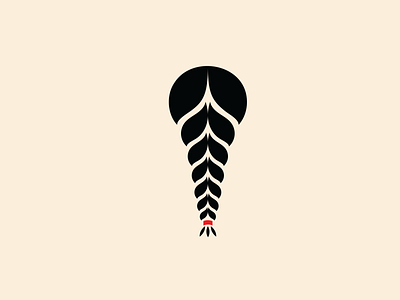
Trenzas Logo
The winner logo for the client.
Abstract logo for Trenzas.
This was the organizations option 3 logo. As option 2, this is an abstract representation of a pony tail but carefully created to represent both men and women that would be represent the organization.
Something also noted when presenting, the typography was carefully chosen because of its meaning. The type name is Juana type and it was created by a powerful, independent and activist latino woman, it turned out one of the board members really liked the backstory of the type because of the name relation to her mother.
For more on my work you can visit:
Let's chat!
More by Mario Diaz Bustamante View profile
Like


