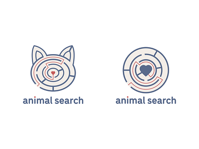
Animal Search Final Logo
As we got closer to the final mark we started to think about the typography.
The second image shows my initial experiments with fonts; Andy wanted to use a brush script font and decided the dot on the i should be a different colour. I also played around with using a sans serif font because I thought the clean mark mirrored how clear and legible a sans serif font can be.
After my initial type designs, we realised the mark needed to include the journey through the puzzle and we narrowed the mark down to two final options (shown on the first image.)
For the final logo, Andy darkened the colour palette and chose a different brush font, which can be seen on the last image.
More by Katherine Cory View profile
Like


