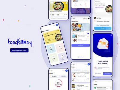
Foodfancy UX Design Case Study
Finally, the UX Design case study is complete and available on my website.
A quick recap of what I have done.
A few months earlier, we came up with an idea to make an inclusive app for people who want to sell their handmade regular food quickly on request. The problem with the existing market is that there is no such app that facilitates the instant selling of food on request. On request means the customer will request the cook to make the lunch for him. And the food will be cooked and served within 1.5 hours max, hence it should be a regular solution for busy personnel to get homemade food quicker.
The user/cooks' pinpoints are :
1. The service should be like a freelancer. The cook will accept or stay offline as he/she wants.
2. The entry barrier for cooks should be low enough so that it includes the large majority of people.
3. The payment should be instant.
4. The cook should have full control of menu setting and imagery.
In the UX design process of the Foodfancy chef app, we followed the Design Thinking framework, as we generally approach every design. We prefer the Design Thinking framework because of reasons. 1. It's outlined by Tim Brown 2. the child of Standford University and 3, widely followed by industry pioneers, like Google. So, we can safely say that it's proven for a successful UX.
We followed 5 steps, a non-linear outline for this app:
✅ Empathize ✅ Define ✅ Ideate ✅ Design & Prototype ➡️ Test
Please see the full design process in this Foodfacy UX Design Case Study here.
==
✉️ Have a project idea? I am available for new projects and a full-time remote position.
Say me hallo at mafruh.faruqi@gmail.com 🔥
Find my works at 🌐 mafruhfaruqi.com
Find me on LinkedIn

