Book of the Month: Offboarding Product Design Challenge
Book of the Month monthly book subscription service for book lovers.
Challenge
I had to identify a product of my choice for my Product Design Challenge where I felt the UX was broken. I then had to share how I got to my solution, including my thought process, three rough wireframes and challenges of my different approaches, and how I ended up with my final solution.
Where the UX is currently broken
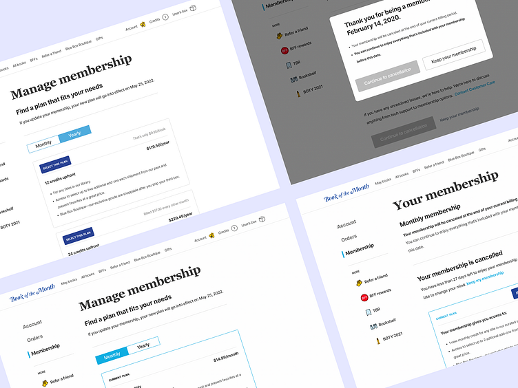
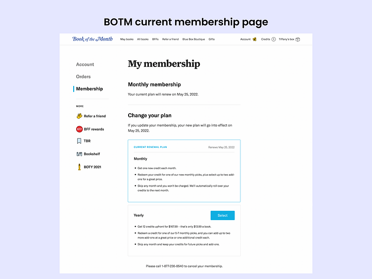
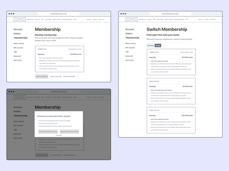
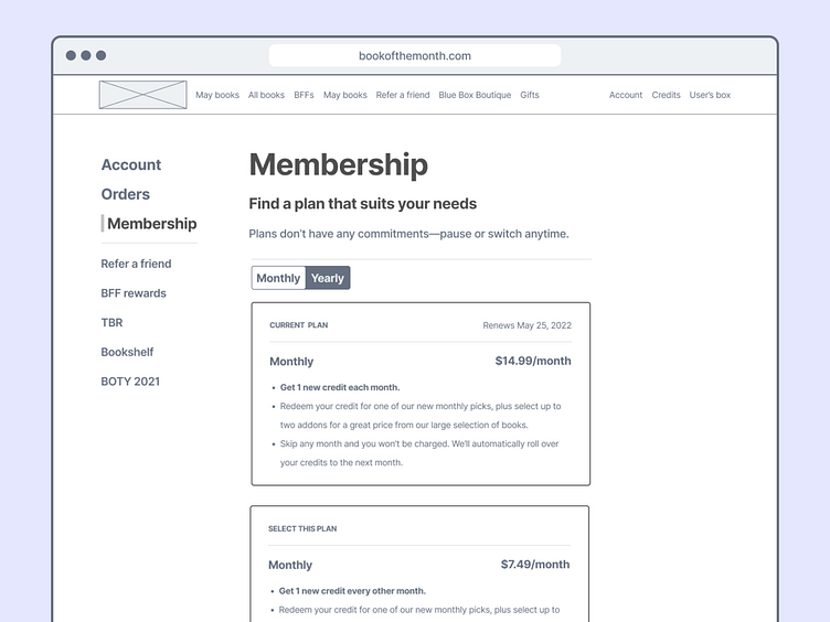
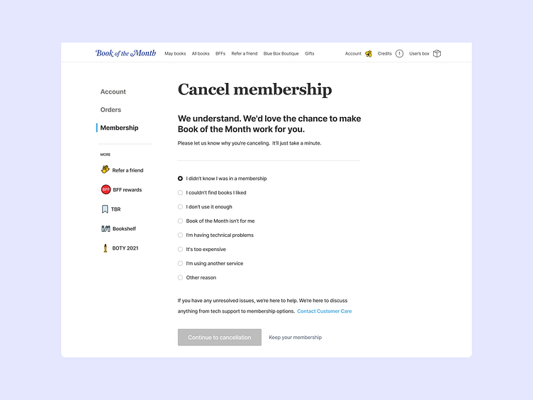
The Book of the Month's membership page is shown below and features the membership page. There are only two options: a monthly subscription or a 12-credit pack paid upfront.
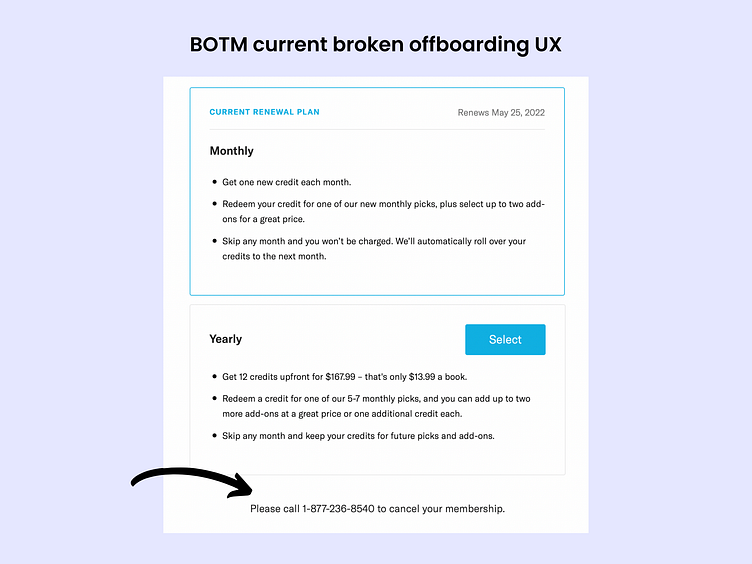
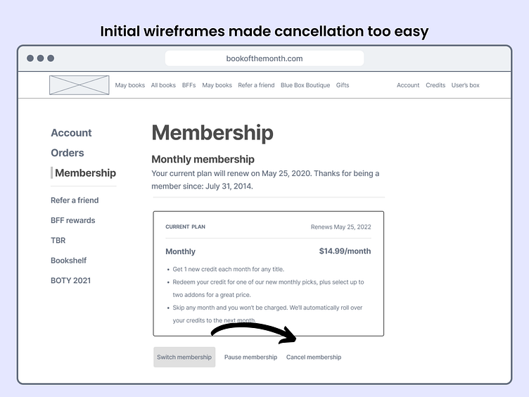
Users cannot complete the task of canceling their membership online and are forced to call if they want to cancel if they can't find an option that works for them.
Also, the website homepage mentions skipping a month, but this isn't mentioned on the membership page.
Why I think it's broken
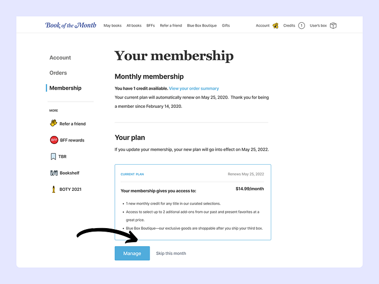
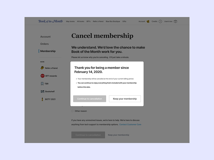
Removing a cancellation button (seen in the image below) generally pushes users in a direction that benefits the business, not the user. If users decided to stop using a service, they’d always find a way.
Memories combine the emotionally intense moments and the ending experience. No matter how much a user might like the service, if their offboarding isn't great, they'll likely remember that.
Initial research
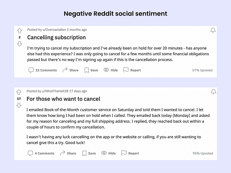
I used available resources such as Reddit to identify and confirm pain points and help with brainstorming solutions.
In these examples, users visit Reddit to express their views about the cancellation process and their experiences.
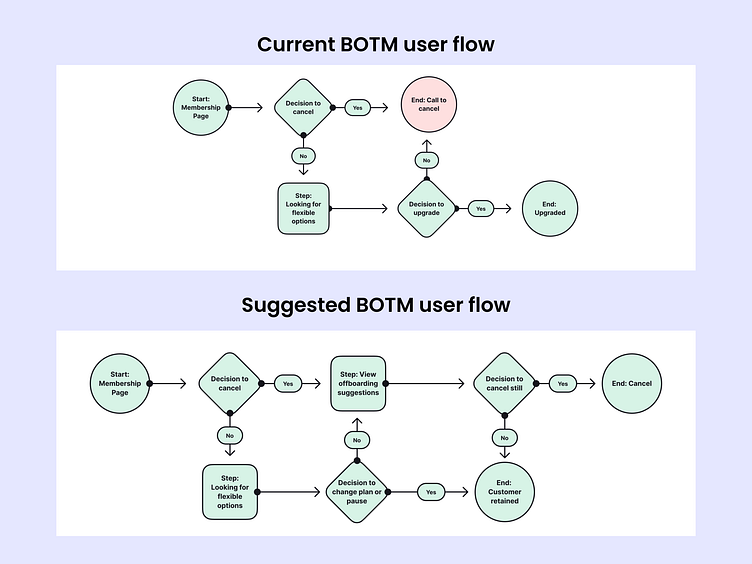
User flows
To help me with my designs, I broke down Book of the Month's current user flow to understand the user's journey and organize my ideas and thoughts. I mapped out a potential user flow with some solutions.
Wireframes
Next, I identified why users might cancel and built some rough wireframe designs.
Users might want to cancel because of time or money. However, users who are tight on time might also still want to keep their membership perks.
Another reason users might visit the cancellation page is to see if there are more flexible options when they don't like the current book selection.
Solutions
I came up with these solutions:
✅ A cancelation option that's easy to find and uses more empathy for users.
Offboarding has an opportunity to leave a good impression on people and turn them into ambassadors of the brand.
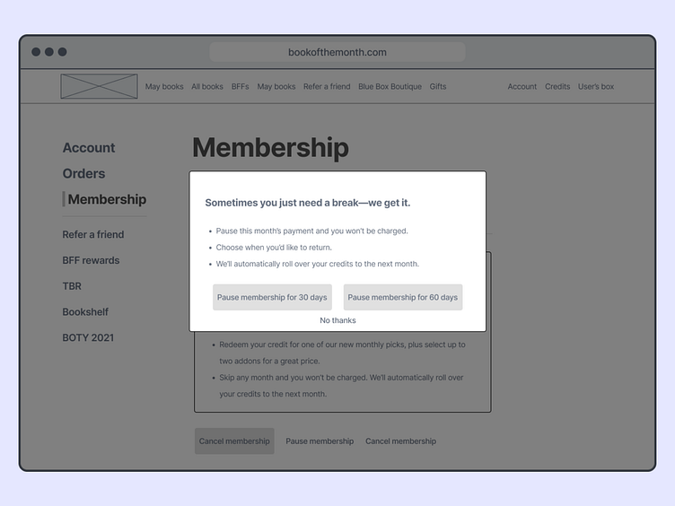
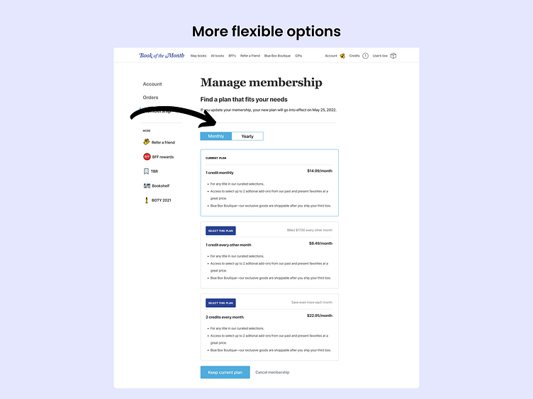
✅ Provide flexible pause or skip options for the users on the cancellation page for those who might be tight on time but want to keep their membership perks. This idea allows users to pause payments for 30 or 60-days directly on the cancellation page for more plan flexibility.
✅ Giving users more options to personalize their plans that might better suit their needs for more flexibility. I thought through some monthly or yearly selections that allow users to select from different price points focused more on "credit packs."
Product Review and Feedback
It was at this stage I completed a product review. I got great feedback that I was able to incorporate into the designs before creating the high-fidelity prototype of the designs next.
"Maybe the cancellation is too easy now. I know it wasn't an option before, but visually, maybe making it harder would be best for business too."
"It's a little hard to tell the options apart on the manage membership page. It might be too much information for users."
"I think a feedback form or a way to personalize the offboarding more could be better for the user too."
Overall Changes
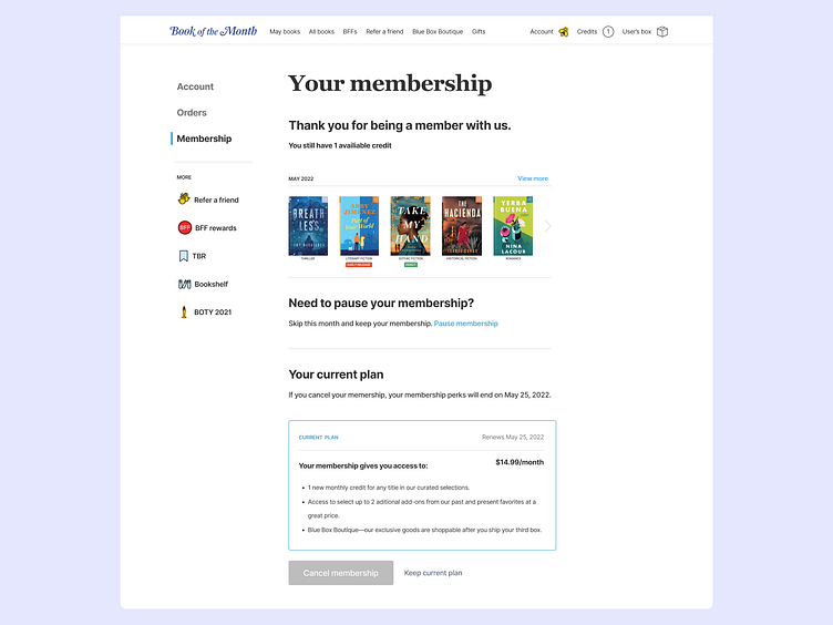
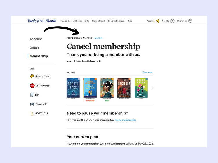
I added an option to "manage" or "skip" directly to the membership page.
Then when you select manage, you now have more plan options for monthly or yearly plans based on the current pricing model, and only then you can begin an offboarding cancel process which wasn't possible on BOTM's current designs.
Offboarding survey
In the new offboarding process, I added multiple steps so the user is aware of what they would lose should they cancel. I also added a way to quickly select books, a feedback survey, and a more robust copy to get important user feedback from those unsatisfied with the current project.
Check out my prototype and go through an offboarding or a skip flow.
Testing
After testing my prototype featuring the newer designs, I got more user feedback that I was able to apply to my designs. Feedback and iterating are always ongoing processes.
"I felt like the canceling was a little longer because I couldn't tell where I was in the flow."
"The font size on the modals might be a little small."
Next Steps
These are the design ideas that I came up with based on the user demographic, social sentiment, and the current user flows. I looked for patterns and pain points users had to help me make decisions on my solutions.
I'd also like to spend more time testing the designs to get more feedback to iterate before implementation starts to ensure we're heading in the right direction.
Next, I could also create two different variations for A/B testing to help me determine which version or variant of something will perform more effectively in the market.
And to measure success, identifying KPIs like measuring customer service calls, monitoring social channel sentiment, and if there is a change in customer retention.
