Teenage Engineering header redesign
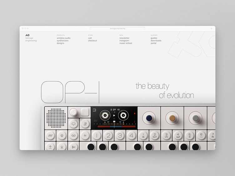
Redesigned the Teenage Engineering site header for practice
Made the layout more asymmetric to match the modernist style
Removed the pretentiously placed Japanese characters in an otherwise entirely Western design
Added contextual decorative typography that actually corresponds to the dominant language in the composition
Constructed a coherent grid
Improved contrast and legibility on menu items
Tied logomark and company name together hierarchically
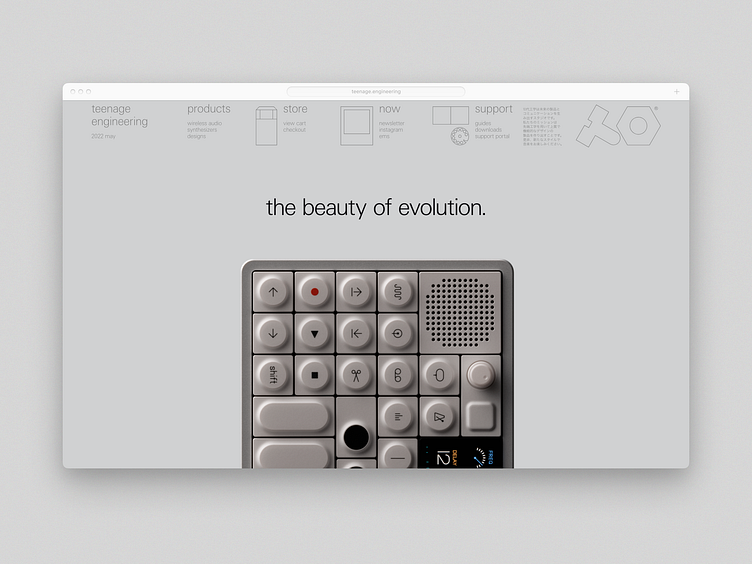
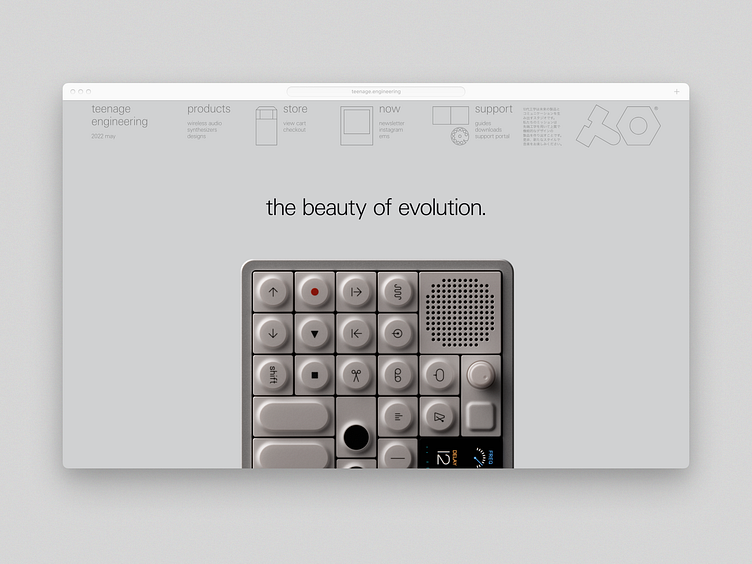
See below for the original design by Teenage Engineering (or visit their site)