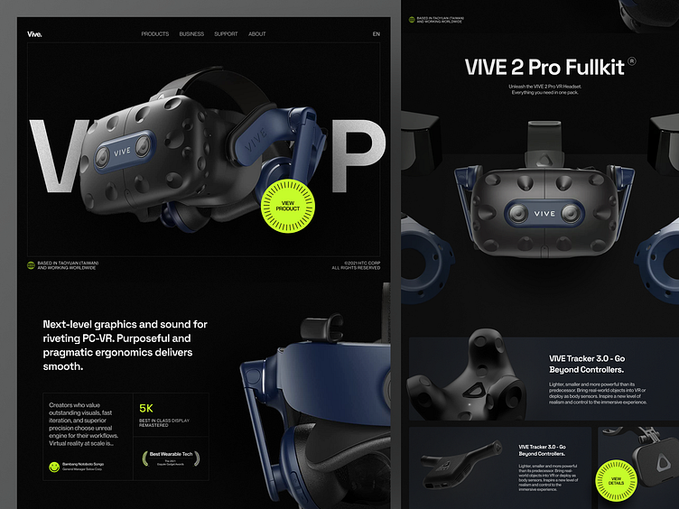
Vive - Product Website Concept
Hello, guys!
Here is my recent exploration design concept for the Virtual Reality Products website named Vive and this is the full landing page design with the process behind it.
Design Process 🚦
Rough Concept 👀
So I started with a rough concept using my pencil before deciding to work on the low fidelity design to imagine what the layout look like.
Low Fidelity Design ✨
I've tried to create a concept that was initially still rough into the low fidelity design in the image above. In this phase, the grid system that I used is 12 col, Margin 40px and Gutter 40px.
Design Guideline ⚡️
Do some exploration and then create the design guideline before moving to the high fidelity design. Long story short, I decided to use 2 types of font, Space Grotesk for the header and Neue Montreal to implement on the body copy.
About the colors, I choose Arctic Lime as the brand color, Vampire Black for the background, and Bright Gray for the text.
High Fidelity Design 🚀
Finally, here is what the Hi-fi design looks like! Imagine if the VR glass has some interaction when the user scrolls down. ✌️
Hope you guys like it and feel free to leave your feedback!
Thank you! have a nice day ✌️
Available for work inquiry
Let's talk: risangedykun@gmail.com
----------------------------------------------------------------------------------------------------
Wanna collaborate with us? Shoot your business inquiry to plainthingstudio@gmail.com
Plainthing.studio | Vicolo | Ui8 | Youtube | Behance...


