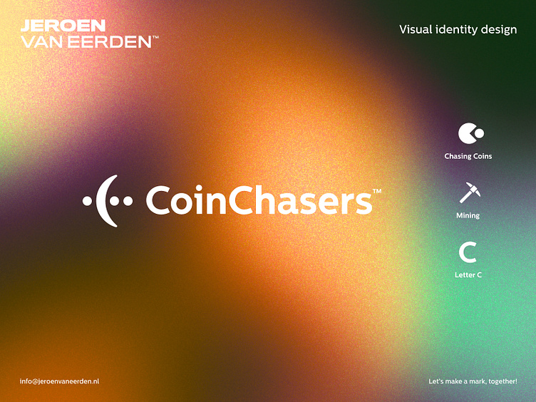
CoinChasers - Logo Design
CoinChasers is the hub for crypto income discussion.
My approach for this concept was to have 3 elements in mind to visually tell a little story into this subtle symbol. The client loved the idea of Pacman who is eating all the coins. Something in that line would be interesting for sure. As their community is really collaborative and active, the dots can also refer to conversations and engagement.
Main elements which could be spotted:
1. Chasing coins element (referring to the almighty Pac-man)
2. Mining coins (as this is part of their business model)
3. Letter C which fitting the brand name perfectly and therefore easy to apply separately.
4. Bonus element = Community dots for conversations.
Happy to hear your thoughts, feedback, concerns and if you might have seen anything done before?
Have a great day! Jeroen
Are you interested in working with me?
Feel free to reach out via the Dribbble inbox or direct e-mail:
👉 info@jeroenvaneerden.nl
