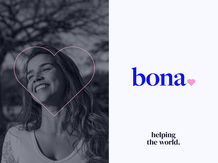
Bona❤️ - Brand Identity for Support Centre
Bona was created to help everyone in need. This is what we were guided by when creating the brand design.
Color palette
A brand should inspire confidence and peace of mind. The blue color is a symbol of reliability and tranquility, while pink symbolizes kindness and warmth.
A lot of warm and family photos are used for materials. This increases trust and humanizes the brand.
Fonts
The serif font is one of the classics and well-known to the user. This initially disposes the audience.
The small heart in the logo symbolizes love. This is an element that will attract attention and will definitely bring a smile.
The heart is also often used in brand design. In addition, it is pretty cute ❤️
More by Outcrowd View profile
Services by Outcrowd
Like


