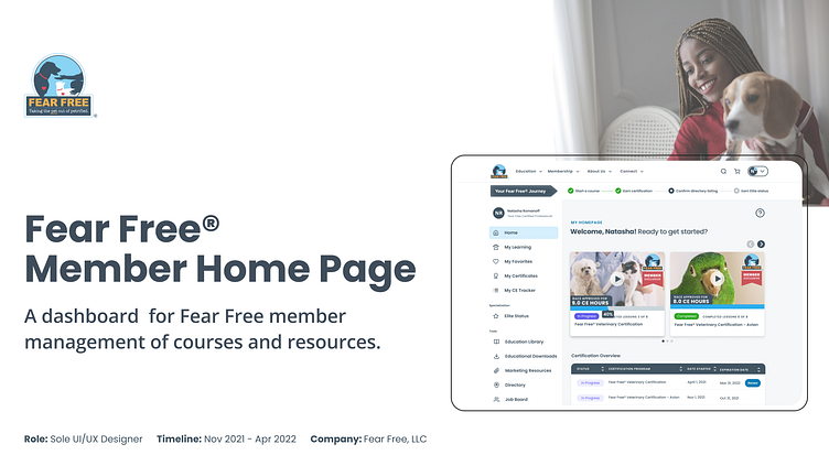
Fear Free® Member Home Page: Dashboard Design
Tools: Figma, Mural, Typeform, Lookback | Timeline: Nov 2021 - April 2022 | Role: Sole UX Researcher, UI Designer, UX Designer
Fear Free® is an online educational platform that allows users to acquire Fear Free certifications in order to improve pet emotional welfare, enrichment, and reduce fear, anxiety, and stress. This project is part of a bigger company initiative to boost revenue through membership renewals, as well as user engagement and awareness of Fear Free tools and content.
The Problem: So Much To Do, So Little Time
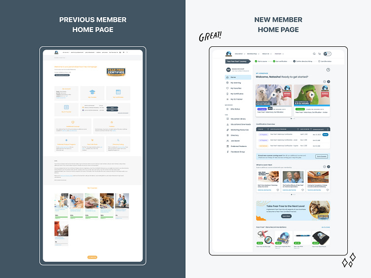
When users sign up with Fear Free, they are greeted with their own personalized home page as a Fear Free member. However, the current home page causes users to miss vital aspects of their membership benefits and on performing key tasks:
1. Start and resume courses;
2. Engage with additional courses and content;
3. Renew before membership expires.
The overwork and short staffing of the pandemic has affected veterinarians as much as it has other doctors and nurses, and dealing with the constant moral dilemmas and emotional output is driving many to burn out. Therefore, there is little to no extra time available to try to troubleshoot any confusion our home page may cause leading to a poor user experience and loss in engagement.
Research
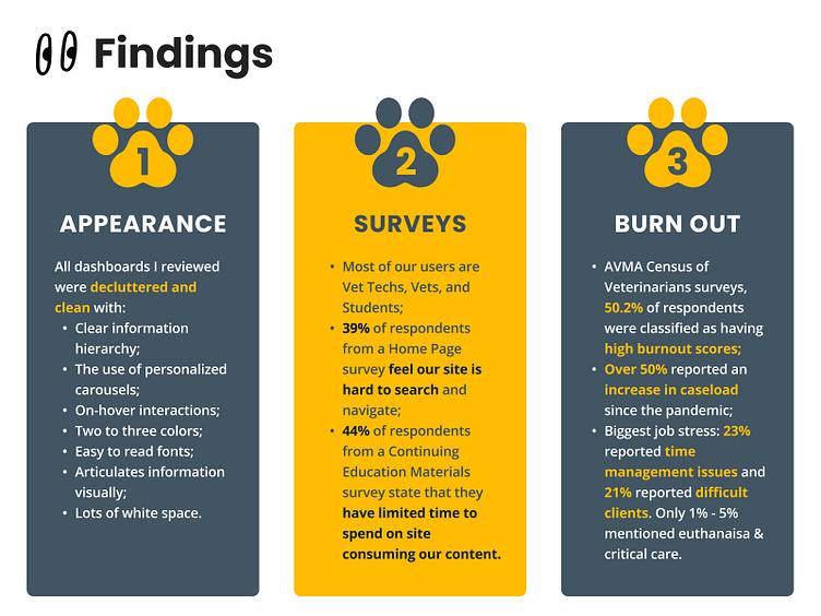
Interviews with our customer experience team and stakeholders validated that users were indeed missing vital information displayed on their personalized Fear Free Home Page. Additionally, I reviewed past UX and marketing surveys regarding our website and user satisfaction. I, then, jumped into researching how other e-learning platforms organize their users' purchases and prioritize display for optimal learning experiences online. I also wanted to see what our competitors are offering and how they were servicing their members.
The following are some of my research’s significant findings:
Synthesis
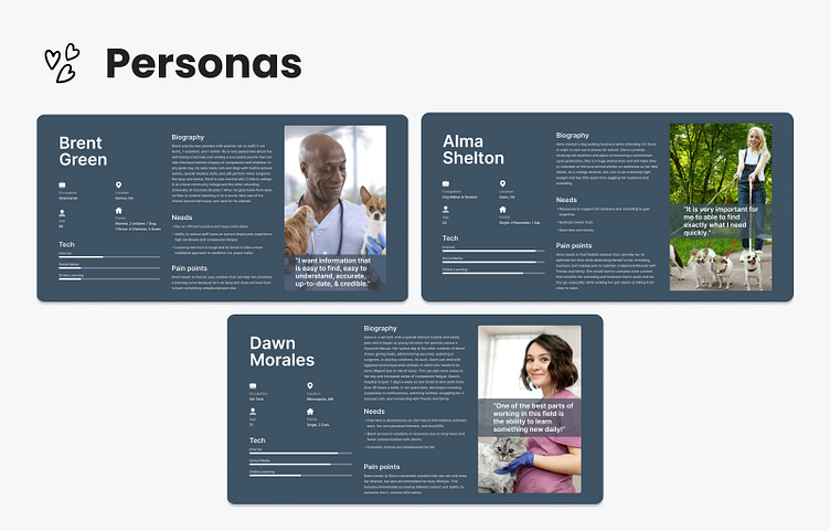
I held a workshop in Mural working with WebDev, Marketing, Education, Customer Experience teams, as well as the CEO. We discussed the responsibilities and pain points our personas could face day to day. This helped me to identify what our users do, think, feel and say. In this process I discovered who our top 3 user types are on Fear Free:
1. Veterinarian
2. Vet Tech
3. Veterinary Student
While creating solutions I would refer back to these personas for guidance.
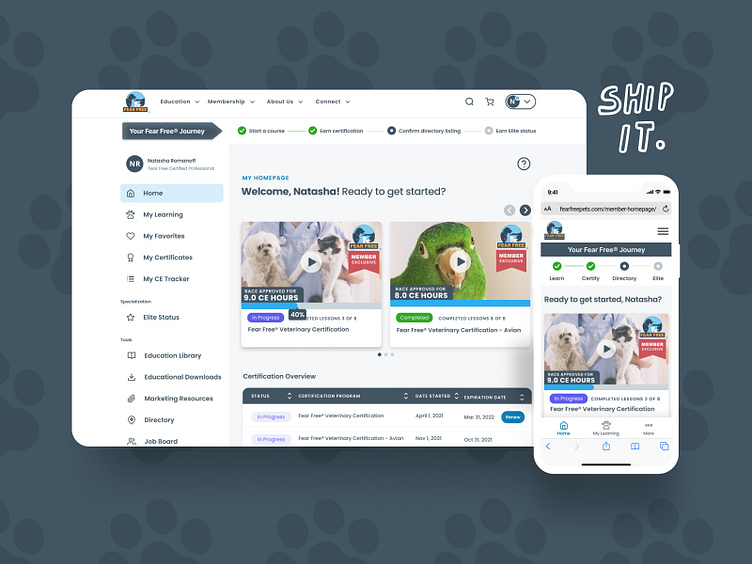
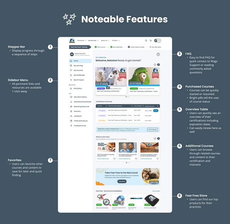
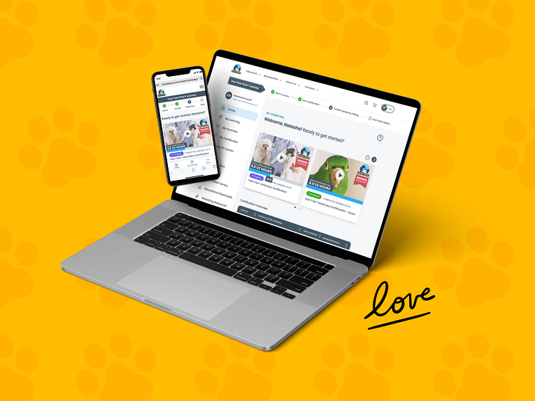
The Solution: Personalized Dashboard
Our goal is to provide a fully responsive, easy to navigate website (fearfreepets.com) that improves content awareness & consumption. Using the member home page dashboard gives users a convenient way to navigate their purchased courses and beneficial tools/resources with an all-in-one place tool. The platform also highlights upcoming expiring certifications with a personalized data table of courses and allows for easy renewal.
User Flows
Based on the persona we created, I worked on identifying 5 Red Routes that clearly communicates the key goals we want our members to achieve:
1. Access Fear Free member benefits in one place.
2. Easily renew memberships about to expire.
3. Start/Resume courses easily.
4. Find additional courses/resources once user has completed certification.
5. Easily track and see Fear Free Elite status.
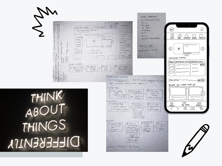
Sketching
I always like to sketch ideas out on paper before I start designing because it helps me to flush out ideas and there's just something about putting pen to paper that inspires my inner creative magic. I first thought about "WTF" or "what's the flow?" I wanted to keep new users and current users in mind as I went through all the steps of my 5 red routes. I also needed to think about mobile as over half our users access our site via mobile. As such, I needed to make sure desktop and mobile experiences would be seamless.
Visual Design
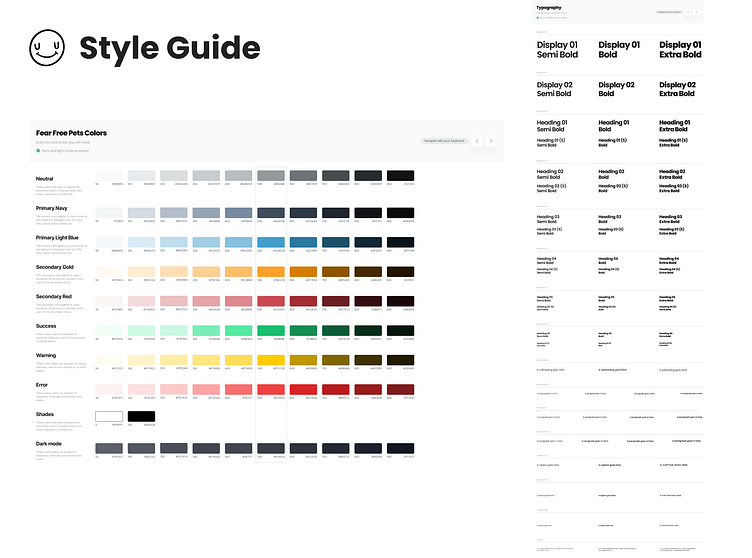
Fear Free has their own marketing material and style guide. However, they have yet to have a style guide for web which I needed advocate for in terms of better accessibility and improving usability for all users. I decided to create a goal for myself to create Fear Free's very own design system that could be applied to other sites in the future.
Wireframes & High Fidelity Screens
Due to time constraints and my team being highly visual, I made the decision to take my sketches straight to high fidelity. I held 2 meetings focusing on design and functionality. I was surprised when the CEO immediately loved the designs and wanted to move forward with developing.
Fear Free is inherently a playful company aiming to make education fun. However, we do stress the importance of research, professionalism, and responsibility. Therefore, I wanted my designs to convey this same mood while trying to maintain a minimalistic mindset so users can easily find and access what they need.
One of the things that stood out to me when starting on the UI was that our color palette is not up to WCAG AA guidelines. I tried creating shades and tints that were in line with our brand but also conformed to a score of 4.5 so that our page is usable and understandable for the majority of people with or without disabilities.
Prototype & Usability Testing
Prototyping:
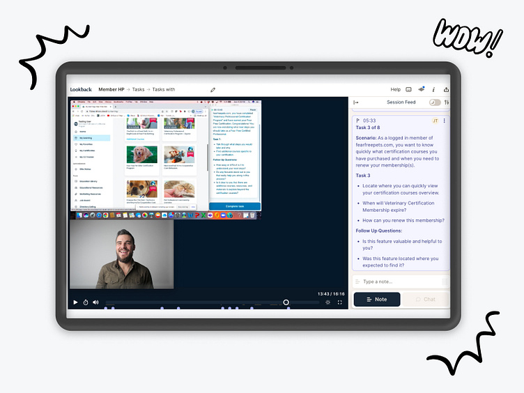
As a startup, our WebDev team has the flexibility and nimbleness to develop design concepts on a stage page for usability testing via Kinsta instead of prototyping through Invision. While WebDev developed the testing stage, I set up a testing plan and script on Lookback.
Usability Testing:
I recruited participants via a fearfreepets.com survey, reached out to acquaintances in the veterinary/animal industry, and asked internal Fear Free employees to test as well.
I conducted 10 unmoderated remote usability test in order to understand any problems that users/members may have while interacting with our new Education Library. Each participant completed the usability test by sharing their screen via Lookback.io or Loom (for internal testing) and talking aloud through their thought processes while completing each task.
I tested the effectiveness of the design by having the participants complete 8 specific tasks all of which were in line with my main user flows and the goals we want to achieve for this build and to discover any difficulty or confusion that the user may be having while maneuvering through the page.
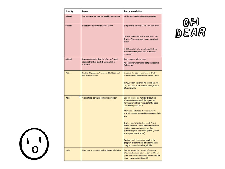
Synthesizing & Redesigning
I utilized affinity mapping to categorize and organize the insights after collecting all of the customer feedback. Then I wrote a usability test report to describe the findings, prioritize the issues, and suggest fixes. I noticed 3 critical issues that needed to be addressed, as well as 3 major improvements.
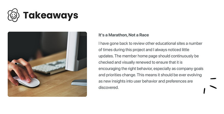
Next Steps
The work completed thus far is only the beginning. More iteration and optimization are all topics of future effort. This includes the following top of mind features:
1. Stepper redesign of when tasks are complete
2. CE tracker updates
3. Add times to cards so users know how long a course runs
4. Update any tagging designs for clearer organization and implement text truncation