Less is more. Right... [2]
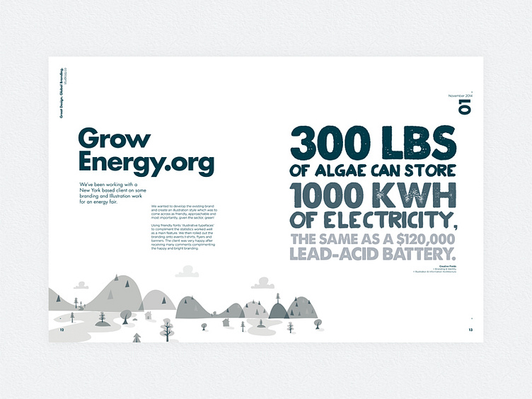
Grow Energy client layout
Layout development for the STUDIOJQ portfolio review newspaper project. I thought it would be best to strip down the original design and play more on a duotone and clean gird.
Overall design concept is to illustrate each creative project whilst keeping consistency throughout in grid and image form.
Follow STUDIOJQ: Behance | Twitter | Pinterest
Designed at STUDIOJQ©
More by MadeByStudioJQ View profile
Like

