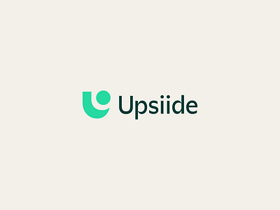
There's always an Upsiide
As part of the rebrand for Dig Insights (see previous post), we also rebranded another member of their brand family, Upsiide.
Part of the brand strategy was to navigate the complex question of how the two brands should play together: where to align, and where to be distinct to position each for success. Both utilize the same logotype for the name, as well as the same circle shape which represented a "nugget of insight" in both marks. However, each mark is also distinct and ownable on their own– Upsiide's mark being built in a "U" shape and mint green, while Dig's is in the shape of an orange "D"
Our team of strategists, writers, designers, and project managers at Focus Lab helped create the strategy, communications, and visual identity for both brands.
Check out the new brands and read the writeup here.
---
Looking for a brand agency? We would love to hear from you.
Email us: hello@focuslabllc.com
