Tepoint visual identity 🌿
Hi Guys! 🙌
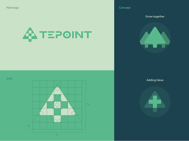
Here I will share a new logo exploration case study "Tepoint - renewable energy company". I support using renewable energy to save our planet and the next generation. so I decided to make a visual identity inspired by several companies engaged in the development of renewable energy such as orsted, iberdrola and General Electric
my approach to designing this logo is
Modern, Simple, and Eco friendly.
You can scroll down to see more details 😎
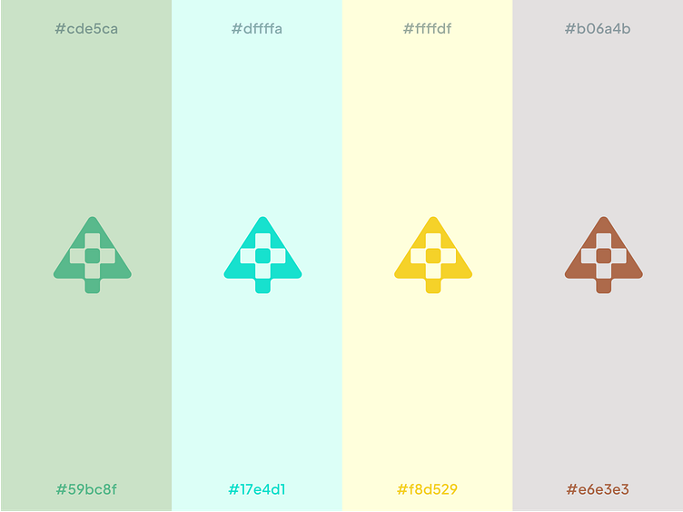
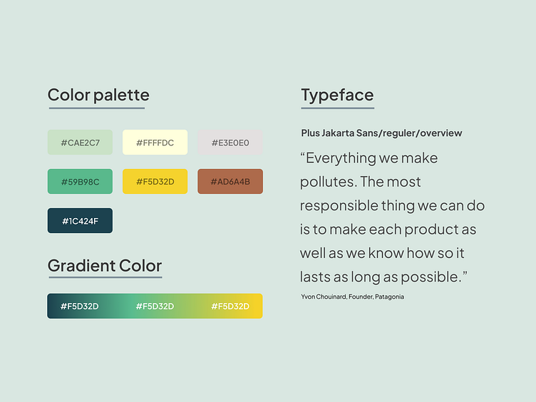
Color
The choice of colors was inspired by various renewable energy sources and the company's mission, such as green representing environmentally friendly, blue representing water, yellow representing sunlight, brown representing geothermal.
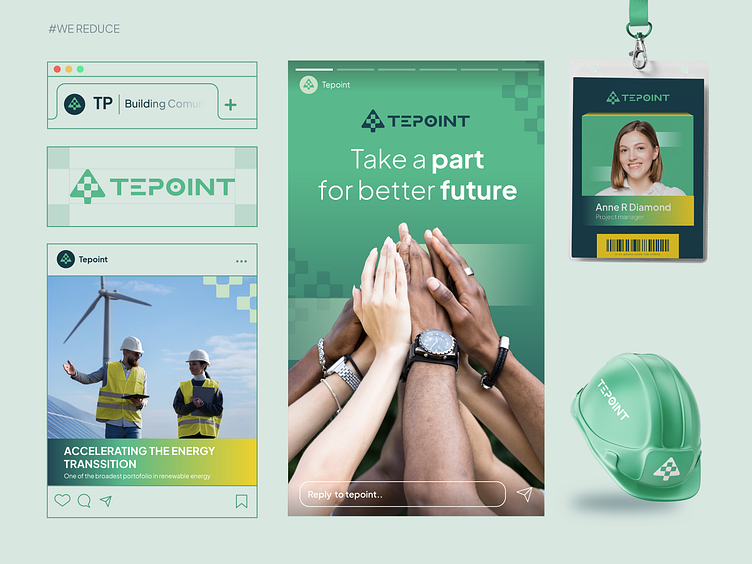
Logo Implementation
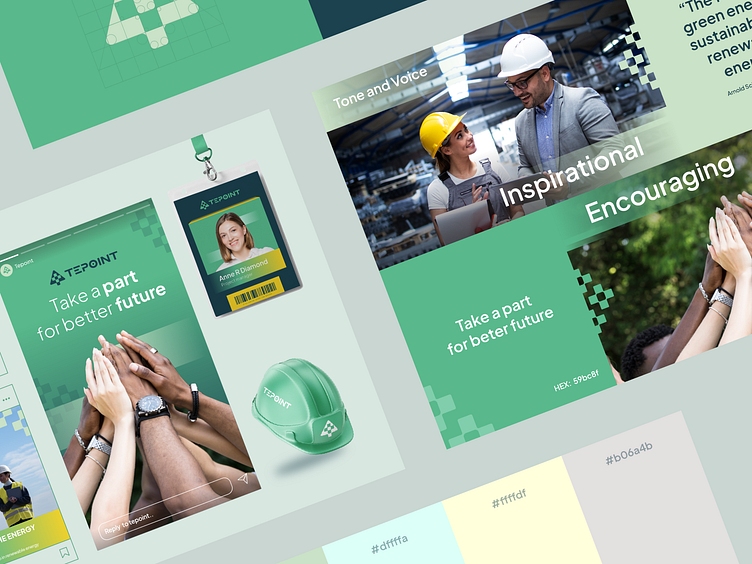
implement logos for a variety of output from id card to Instagram feed.
Thank you for scorlling
Wanna collaborate with us?
Shoot your business inquiry to halomoinstudio@gmail.com
Connect with us:
IG: moinstudio_