Phonesites – Website Builder and AI Marketing Tool
About the project
Phonesites offers a solution that is affordable and easy to use, without having to learn a bunch of technical skills. It presents the features needed to increase leads while remaining creative and inviting to use.
As sales and marketing experts, Phonesites offers a strong coaching team that is focused on educating its customers—therefore, the number one mission of the new brand is to be customer and success oriented.
What we found out from our Brand Workshop with the client:
Phonesites is an educational platform that supports its customers while staying modern, rebellious and fun to use.
The priority is to be customer oriented, to work as a team, and to create an exciting experience for users. Phonesites is innovative, direct, and transparent.
Phonesites provides easy software that helps others gain control and learn how to manage their businesses on their own, while feeling confident and motivated.
Challenge
Phonesites had a clear vision and mission – build easy to use software for everyone who needs to improve their business and get new leads. However, the existing visual identity of the brand was not in line with this mission and with the users’ needs.
To achieve these goals, it was necessary to refresh the look of the platform and to make it attractive and fun to use through intuitive UX and by creating easy navigation through the application.
Solution
We have refreshed the Phonesites brand by stylising the existing logo and creating a new visual identity. The UX was improved through various case studies and by adapting the feature layout to the users’ needs and experience. No matter if you’re a small agency or a business owner, if you’re tech-savvy or not, the new updated and modern platform allows you to easily maintain and grow your business.
Creating the new brand
After a detailed competitor analysis, we refined the typography, defined a new colour palette, updated the existing logo, and made the whole experience more fun by using different patterns and imagery. Our visual identity, with blue as the primary colour, now resonates with the core goals and Phonesites’s approach—trustworthiness, integrity, communication, confidence.
Refreshed logo
The existing version lacked balance and looked outdated. With the unflattering red colour, it didn’t match Phonesites’s voice and core values, such as communication and honesty. It needed to be updated in a way that would invite users and exude a modern look.
Typography
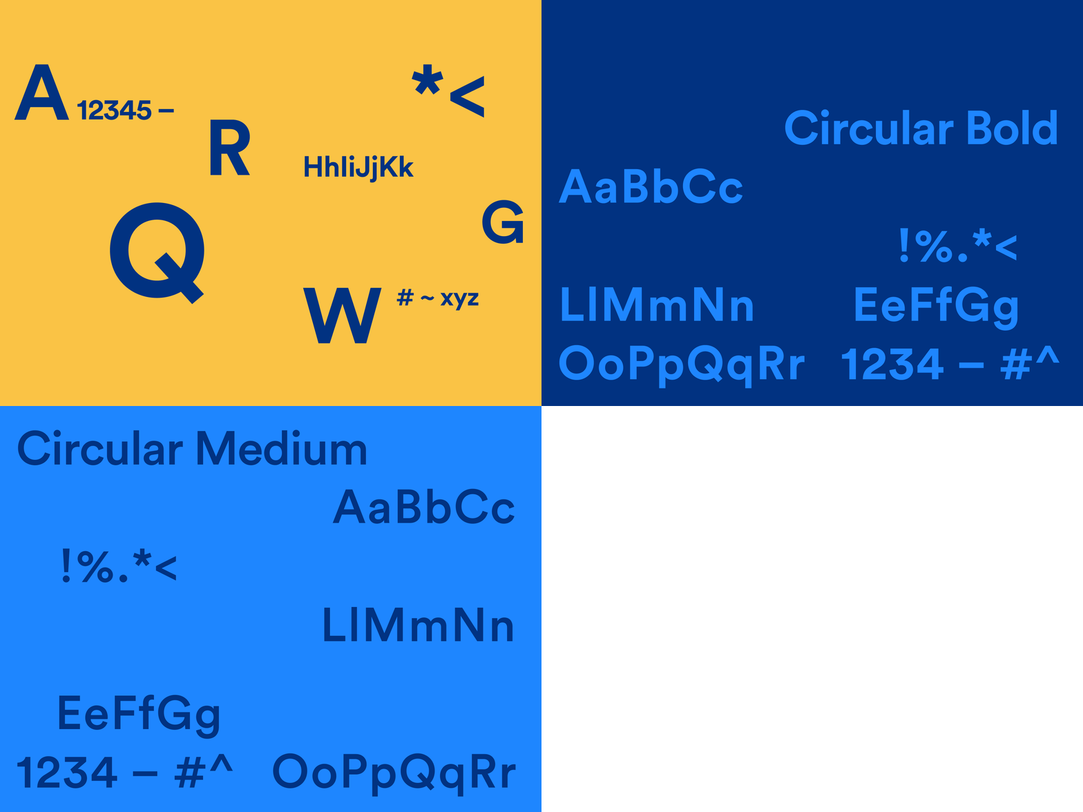
Described as "a new take on a classic genre," Circular was our choice for typography. While it's bold with a geometric base, its appearance is classic with a strong character and personality, and it is a really friendly and modern sans-serif, which was exactly what we needed to incorporate in the new brand.
New palette
The new colour palette is more modern, fresh and tech-savvy. Blue shades and white as primary colours represent clarity, order, ease of usage, trust, and stability. Phonesite is all about creating a community and getting involved, catering to its customers, and implementing a human approach. That’s why we chose yellow as an accent colour that symbolises joy, socialisation and cheerfulness.
Patterns
In order to achieve a fun and inviting look, we’ve introduced patterns based on our new stylised logo, which provides consistency through design as well.
Illustrations
We paid extra attention to creating numerous illustrations that represent the process, usage, and the platform itself, while respecting the new brand guidelines.
The illustrations are a combination of simplified real-life application, imagery, as well as patterns and other elements.
Icon set
The new icon set consists of solid fill icons; minimalistic and balanced.
Website
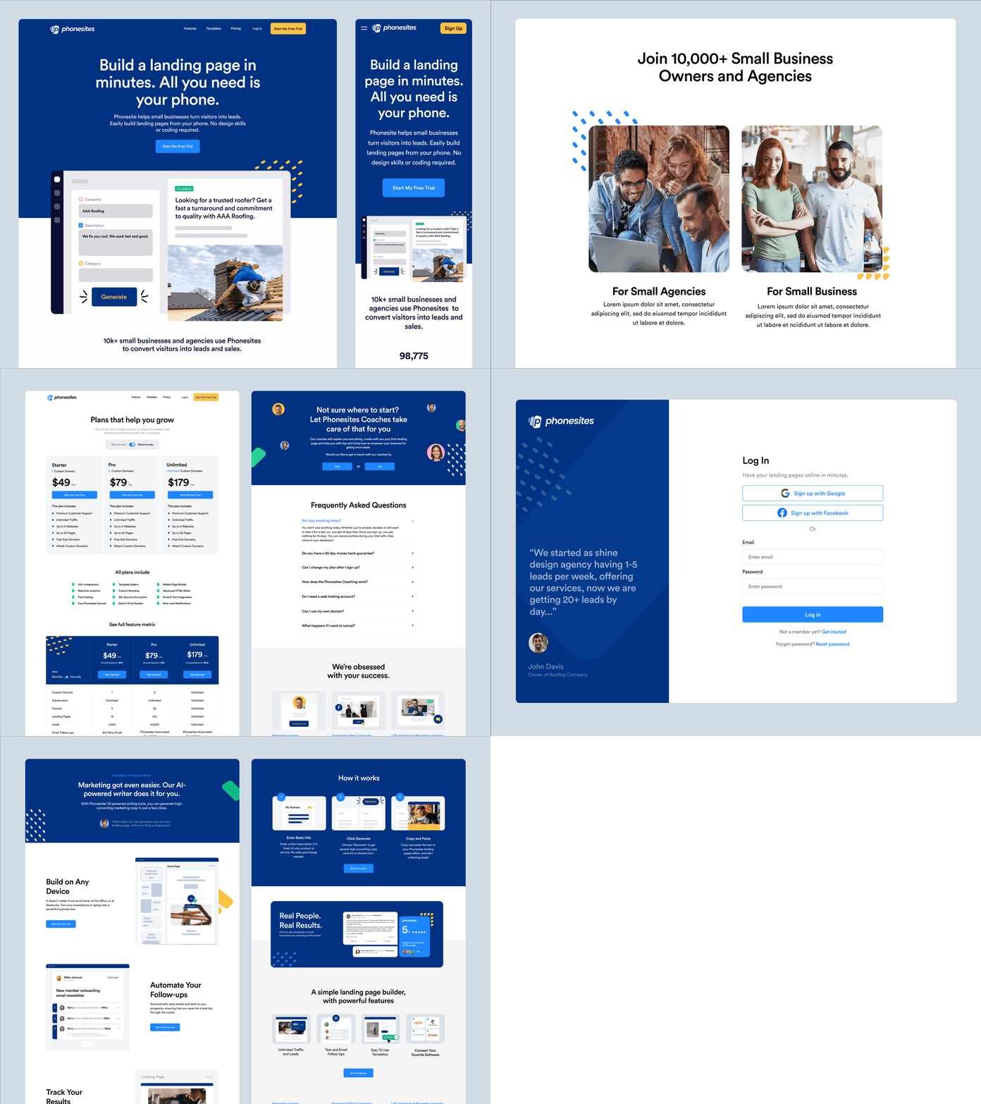
Phonesites’s website has been refreshed with the new branding. It was needed to create a landing page, a pricing page, a terms of service page, a features page, and a check-out.
Application
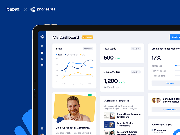
The existing application needed to be more intuitive. The dashboard had to be analyzed and organized, as it lacked structure, features, and hierarchy.
We started off by creating the dashboard UX. To do this, we studied in detail the needs we had defined during Day 2 of our Brand Workshop: personas. Then accordingly, we made a matrix of all possible features that could exist on the dashboard.
Once we had defined the structure of the dashboard, it was time to apply the new brand. The new version has more features; it is compact and more organised. The layout has been carefully created: we have prioritised features. The order on the dashboard is determined by user needs and by which features they’ll use the most often.
The application consists of the main dashboard, the templates page, the projects page, the editor, and the AI content writer.
For better responsiveness, a 12 column grid was used, and so this design could be easily adapted to any device.
Editor
The Phonesites editor is a great tool for everyone who is not that tech-savvy, but is seeking to improve their business. It allows users to create landing pages in the most intuitive way there is, without having to be a technology wizard.
We had to improve the layout and the UX of the old version first. Before that, we did a thorough analysis of all the tools that exist, and in communication with the client, we added a few more useful tools for a complete user experience.
The most important change we made was adding the ability to edit elements directly within the window, without the need to open a new preview window with each change, as it was before. Now it's possible to quickly and easily change all the elements with an instant preview feature.
Another addition is the template option that allows the user to select a template for a specific section (e.g. hero), instead of creating it from scratch.
AI content writer
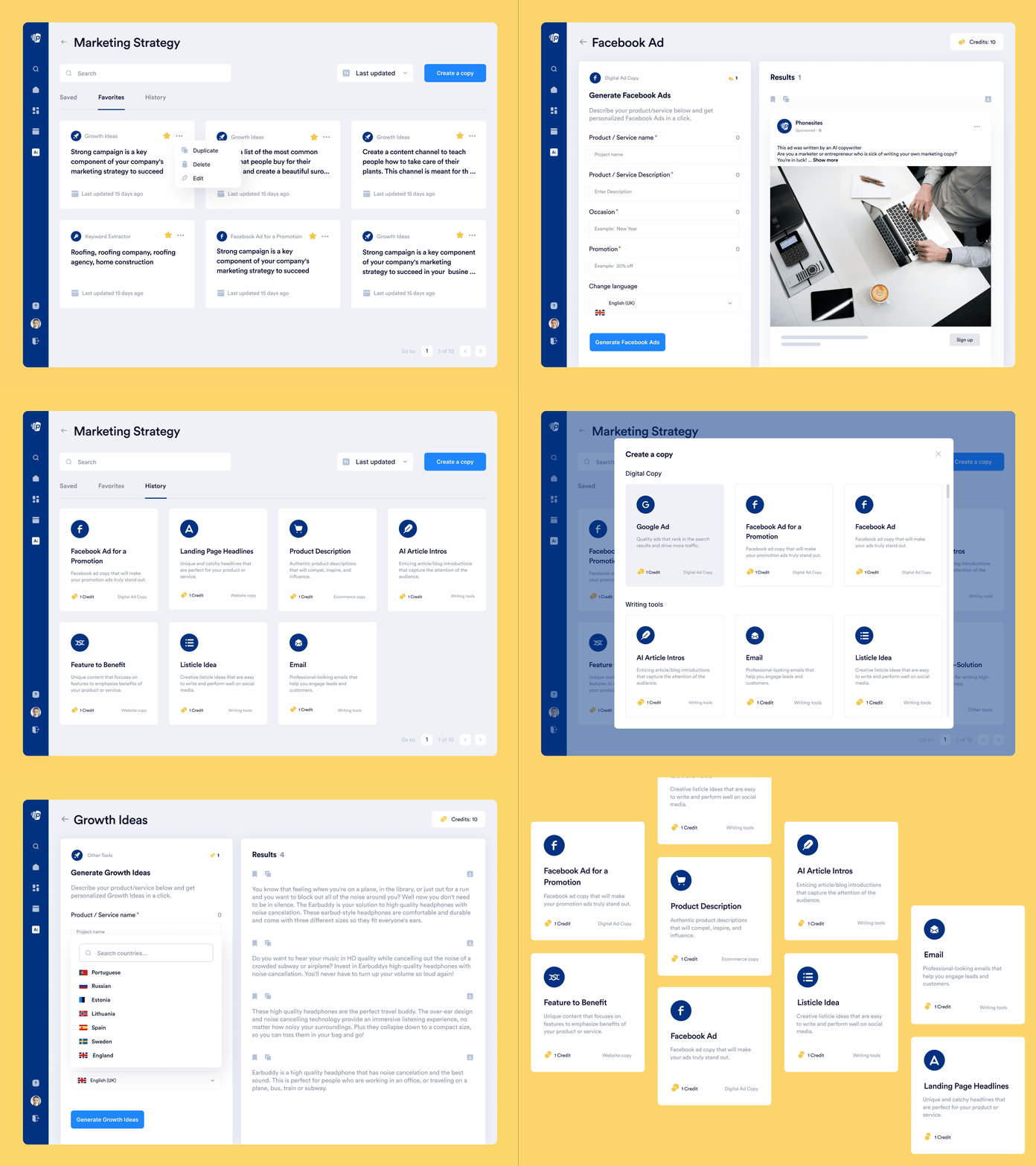
The new integration of Phonesites is the AI content writer, an amazing tool for all those who want to improve their copywriting and to show off their business in the best way.
Guided by the same principles as for the editor, we wanted this tool to have an instant visible change, all in one place; compact, without opening other windows and without additional steps. The AI writer is easy to use and very intuitive, with options to easily set up the language, and to download, copy and save the generated content.
Result
Phonesites was a very interesting project and we really enjoyed working on it. We managed to rebrand and refresh the old platform, make it beautiful, fun to use and accessible to anyone. We have created a responsive application that allows you to design beautiful landing pages on any device, in the easiest way possible, as well as writing content. We are proud to be part of such an important project that will help millions of users improve their business and raise it to a new level.
Phonesites is live. Check it out on LinkedIn, Instagram, Facebook and Twitter.
________________________________________________________________________________________
Designers on the project: Stefan Tošić, Tajana Tomić and Milica Stojković


