Ambigram
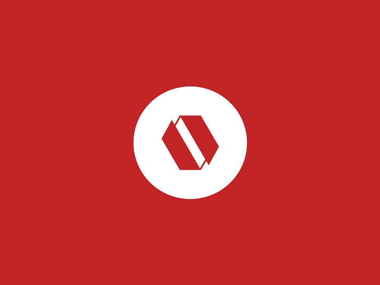
Here's a quick shot of my company's logo, called "Ambigram".
The greatest challenge was to create a symmetric "a" letter, which is not that easy considering that it can mostly looks like a "e" when you flip it. I may have more than a hundred version of this! Working on his own identity is always tough but I'm quite satisfied with this result. Simple.