BCA Mobile - UX UI Redesign Exploration
BCA Mobile is a banking application service by @goodlifebca that provides easy banking transactions through KlikBCA or m-BCA. Previously, BCA Mobile is quite a popular banking app in Indonesia with its old classic UI that has been outdated, even though the UI is outdated still the BCA Mobile is one of the most used mobile banking apps in Indonesia, due to the great offline or online service center among to the Indonesian.
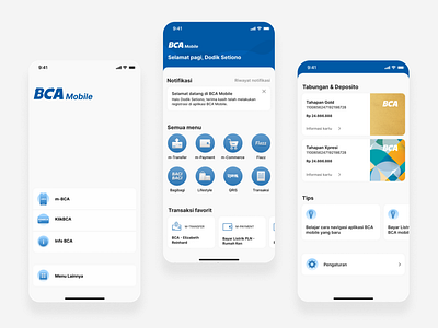
Here we come out with the new redesign for the BCA Mobile app, which offers the new UX and UI for the many aspects. Here for the easier navigation, considering by variety of uses of BCA Mobile dominated by older people, we make the homepage one scroll only with clear and bold visuals. With that, we bring the more clean and simple directions of the Setting page, through minimal and modest architecture. On the Setting page too, we give the more advanced Theme and Look of the BCA Mobile, by adding the ability to switch to the dark mode, change the text size, icon size, even make the text bolder by reason of the various user, that most older people tend to use the bigger and bolder text and huge icon for easier sight. What do you think about our redesign? Does redesign the BCA Mobile service a good choice or vice versa. Share your thoughts below and gives your opinion about your experience or the usage of the BCA Mobile. Thank you
Follow us for more in Instagram at @tehseduhco
