Basecamp Landing Page Redesign

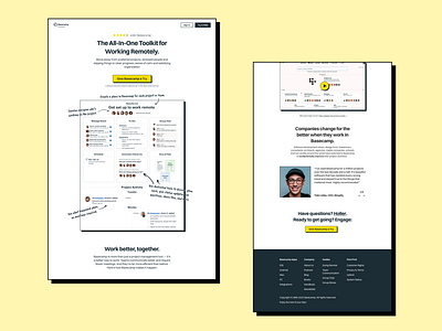
Basecamp did a great job designing their landing page. However, the original one feels too 'heavy' and it most likely reflects on conversions.
I added a lot of needed white space and removed a few elements that don't belong to the landing page (Like another product - their own book. Seriously, who thought that it was a good idea to promote 2 products at once?).
Thanks to Fontshare for their awesome Switzer typeface.