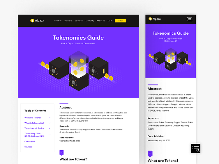
Tokenomics Guide Landing Page
Here's a sneak peak into my design process from concept to creation, enjoy!
Ok, so what's this for?
Introducing Alpaca's Tokenomics Guide! This initiative was designed to boost the company's SEO and marks the first launch of offering our community this genre of ungated, mind-enriching research reports. The goal and purpose is a symbiotic result that'll both benefit the company's MQLs, and enrich our community's understanding of the ever-evolving crypto world entering the Web 3.
The starting point.
Like every masterpiece, it starts with a muse, an inspo piece, a reference! Crunchbase's Cybersecurity Research Report from 2021 acted as such for this project.
It was a great opportunity to understand the layout of such a piece, as this report wasn't to be created as a standard PDF document. Having studied their design, I as a user noticed one big 'rage click' flag — the table of contents (TOC).
As a designer, I'm grateful to have had this reference point to improve our application of our TOC interactivity. The two main things I sought to improve and apply were:
The need for the TOC to have a fixed position while scrolling through the report. That way the user can refer back to it at any point without needing to continuously scroll up to find it just to be brought back down to their desired section.
Interactive indicators for when users hover and select a section. It is always important to make an interactive element obvious to the user by offering a reaction in your design to a user's hover and/or click states.
The visual system.
There were many elements to consider on top of the TOC. Graphs, tables, typographic decals and a minimal wave pattern became the sum of a whole system. Minimalism was the key to optimize legibility.
As you can see, the aesthetic featured purple as the main spot color. This is Alpaca's upcoming addition to their palette! Due to their crypto-positioned stance, this whimsical, vibrant purple was established to manifest this digital era energy.
Greys were included to support and not overpower the purple, and the clean sans-serif typography was embellished little bit of ✨ spice ✨ to improve both hierarchy and appeal.
Finally, as we all know, with a system comes the establishment of its components!
Let's give some app-reciation to mobile 👏
With less space, comes innovative ideas! We all know it's best practice to start with mobile design then scale up to desktop — but I do relish a good challenge.
Aside from the TOC, the rest of the elements were quite intuitive to scale down. Here, I opted for a slide out menu that opens upon clicking the icon I designed. This button stays in a fixed position while scrolling to ensure easy access throughout the report.
It's... alive! 🧟♀️
Ah yes, the prototype phase. Though Figma has a lot to improve on their interaction limitations, the idea can still be conveyed through proper instructions by leaving dev-notes.
Please enjoy the preview of the main mobile interactions. May update with desktop later— but that's a problem for another day.
Cheers!


