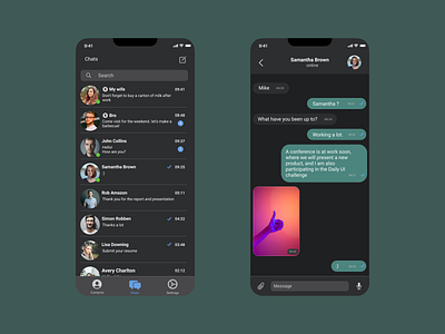
Mobile App - Messenger (Daily UI, Day 13)
I tried to make the messenger easy to use. Therefore, all information garbage was removed. I chose the dark theme because, according to statistics, it is used more often.
I made for #DailyUIChallenge.
What do you think about it? I would love your feedback! If you like it, please press "L"
***
Here my work on Dribble - https://dribbble.com/pkoretskiy
Chat with me, just sending me a note - pashakoretskii@gmail.com
More by Pavel Koretskiy View profile
Like
