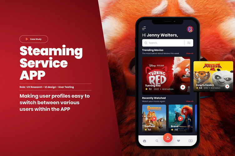
Streaming Service 🎥 Profile Switching
Problem Statement
Younger users are having trouble transitioning from their parents profiles to their own.
Users as young as 4 have their own profiles so they can access family friendly content, but sometimes it takes more than 10-12 movements on their controller to get to a hidden profile switch screen.
Possible Solution
Design a new solution for the Younger user to navigate in simple steps to their desired profile by making sure the navigation is clear at any point in the customer journey so they can switch within a few clicks
User Research
We have hundreds of user interviews and user research. All signs point to younger users (4-8) having a difficult time finding where the profile section lives in the application.
Market Research
Enter your text hereWith the increasing change in customers’ social behavior, which is shifting from traditional subscriptions to broadcasting services and to over-the-top (OTT) on-demand video and music subscriptions every year, OTT streaming in the forecast period is expected to grow at a very fast pace....
Risk & Reward
Parents will get frustrated and unsubscribe from our streaming service. We will lose revenue from our inability to solve this small problem.We expect subscriptions will stop dropping from households with young children if the parents and kids have a smoother experience sharing the streaming service in the home.
Information Architecture
We have hundreds of user interviews and user research. All signs point to younger users (4-8) having a difficult time finding where the profile section lives in the application.
User Flow Diagram
Below is a flow for the user for a simple route to reach to switching the profile of the user.
Once the profile picture is clicked the user will get a pop up menu to switch to a new user or create a new profile within one click.
Wireframes
The Ideate process of wire-framing was to flesh out many ideas and possible solutions of how the user can visually navigate through the APP in a clear and simple way.
User Testing
I tested this flow to around 5 people remotely, from my observations I found that the users found to easy to switch the user profile, due to the patterns of clicking on the profile image, some feedback I got was to include multiple ways of doing this action so there are more pathways.
The next iteration I would expand on the profile concept to adding more ways of switching the profile like through different menus etc....
Figma - Prototype
for collaborations:


