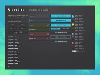
Exosite Style Guide
Interface Style Guide for Exosite. Took the brand colors and extended the palette with help from my tool, Clutch.
Also tested for usability with a colorblind chap I work with, which resulted in the larger, clearer, check and x marks on the inputs.
More by Darcy Murphy View profile
Like

