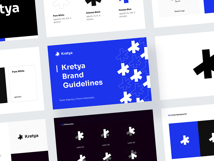
Kretya Brand Guidelines 🔥
Something exciting is coming your way 👀
We Create, We Design, We Are Kretya
It’s HERE! Introducing Kretya Studio, we are a design studio based in Indonesia. Our core value is to Build an Ideas With Visual Approaching Solutions 🔥
To achieve that value we build our identity to make us unique and different from others, this is our Brand Guidelines
This is our logo, a simple shape with 5 square and “Kretya” letter
We use 3 colors as our identity, 🔵Persian Blue, ⚫️Chinese Black, and ⚪️Pure White. Our main color is ⚫️Chinese Black and ⚪️Pure White, and the accent color is 🔵Persian Blue
Kretya is (n.) a place from which one's strength is drawn, where one feels at home; the place where you are your most authentic self.
This word comes from Sansekerta Language the meaning is Prosperous
Our shape at the logo come from our name “Kretya”


