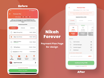
Payment Plan Page Re-design
I made this as a part of an assignment for a company. The main problem statement was to re-design Nikah Forever Payment Plan Page of App keeping UX in mind that solves a major problem. The drop-rate on the plan page is high. Thus, Conversion rate is very low. Customers always face problem in choosing the best plan option. My take, was to keep minimum plan options on screen at a time and focusing more on the services provided in each plan instead. Original app design credit @nikahforever.
More by Sakshi View profile
Like
